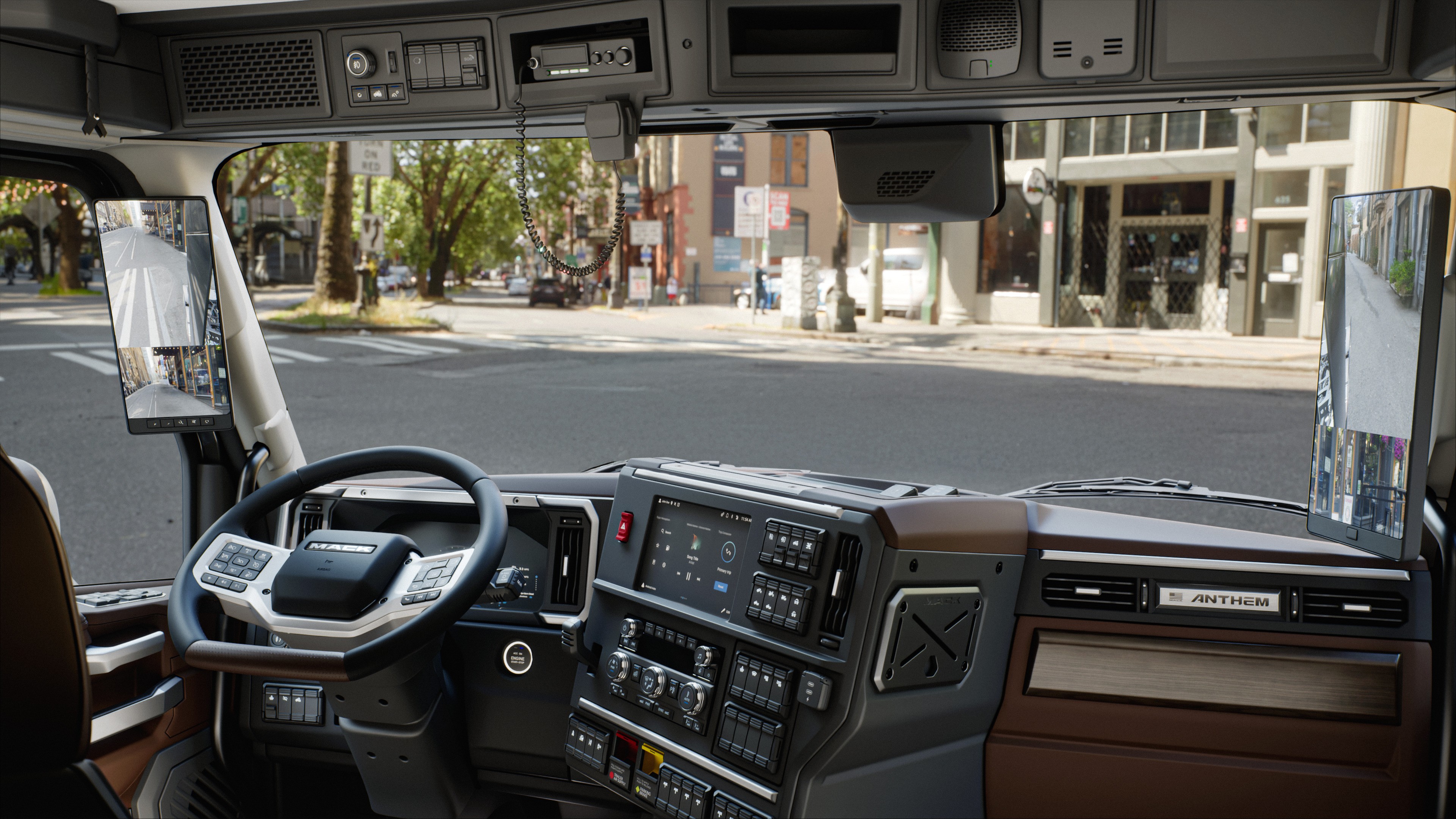
In-Cab HMI &
Driver Experience


CONFIDENTIALITY NOTICE
Due to confidentiality & the nature of projects currently in development, I'm unable to share specific data, internal deliverables and proprietary findings from this project. All images are sourced from Volvo Group's public library. The process, methods, and outcomes described here reflect my genuine contributions.
Overview
A platform used by millions of professional drivers,
every day, at 65 miles an hour.
Volvo and Mack trucks run one of the most complex in-cab digital platforms in the commercial vehicle industry spanning the instrument cluster, infotainment display, and in-cab dashboard controls. Millions of professional drivers interact with this system daily, in motion, under pressure, and on long-haul and regional routes.
Unlike passenger vehicles, commercial trucks serve as both workspace and, for long-haul drivers, a living space. This extends the design challenge beyond the driving task including how drivers rest, manage their environment, and navigate systems during non-driving hours in the sleeper cab.
Role
Usability Team:
Driver Interface & Usability Specialist
Timeline
2023–2025
collaboration
Usability Team (North America), UI Designers, Engineering, Product, Global Platform Team (Sweden)
market
Volvo Trucks - USA, Canada
Mack Trucks - USA, Australia
The Challenge
New generation, new features, new complexity
and no shared UX standard to design against.
Safety vs Functionality
The more useful the system, the more it asks of the driver's attention. Every feature added is a potential distraction. Every UX decision is also a safety decision whether it acknowledges that or not.
01
Complexity vs Glanceability
Drivers need access to navigation, climate, media, and vehicle status simultaneously. The interface must surface the right information at the right moment without requiring the driver to search for it.
02
Global vs Regional
Volvo HMI is built globally. North American drivers have specific expectations around terminology, units, information hierarchy, and interaction patterns that a global system doesn't automatically address.
03
“The strategic question was how do you adapt a connected truck platform built by teams in a different country to work for North American drivers, across every touchpoint from hardware to software to sound?”
My Role
What I worked on
8+
Prototype Validtion studies conducted
3
User testing methods
used
18+
Truck drivers surveyed per study
8
Truck HMI features improved
6
Teams collaborated with
Eye Tracking & Usability User Testing
Physical Hardware UX Review
SW Build Evaluation (Lab Rig)
Competitive Benchmarking
Platform Guideline Authorship
On-Road Testing & Regulatory Alignment
Standards Audit - ISO & FMVSS/CMVSS
Requirements Documentation
UX Copy & Localisation
Prototyping & Questionnaire Design
Sound Design UX
UI Approval Reviews
Feature UX Input & Roadmap
components i owned
A system of touchpoints, not a collection of screens
The Volvo HMI platform spans a coordinated set of physical and digital touchpoints that together form the driver's complete in-cab environment. Design decisions made at the platform level propagate across all of them.
I owned the work done on the components below from my team.

secondary infotainment display (sid)
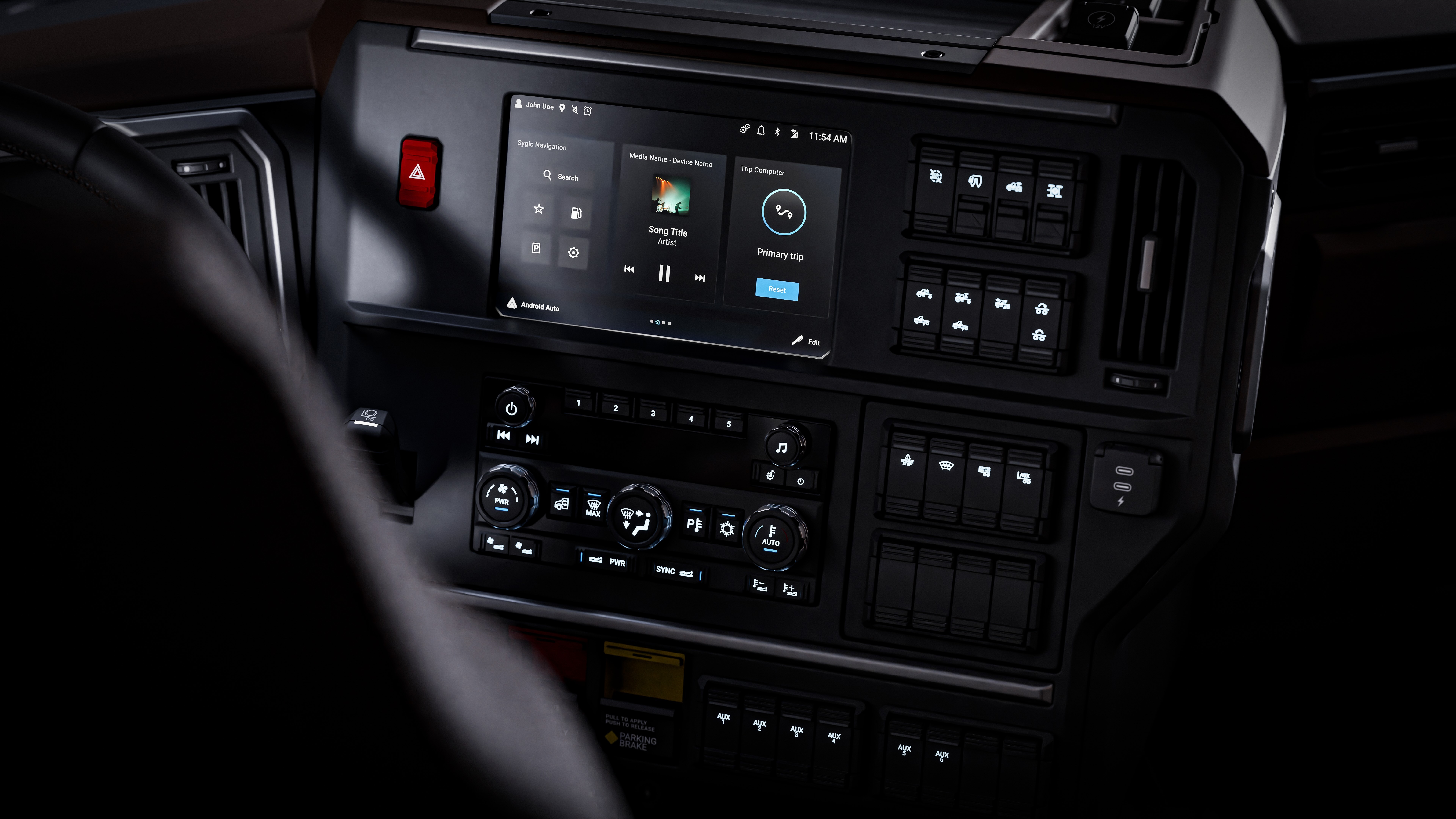
Main touchscreen and hardware controls for media, climate, navigation, settings. Higher interaction depth.
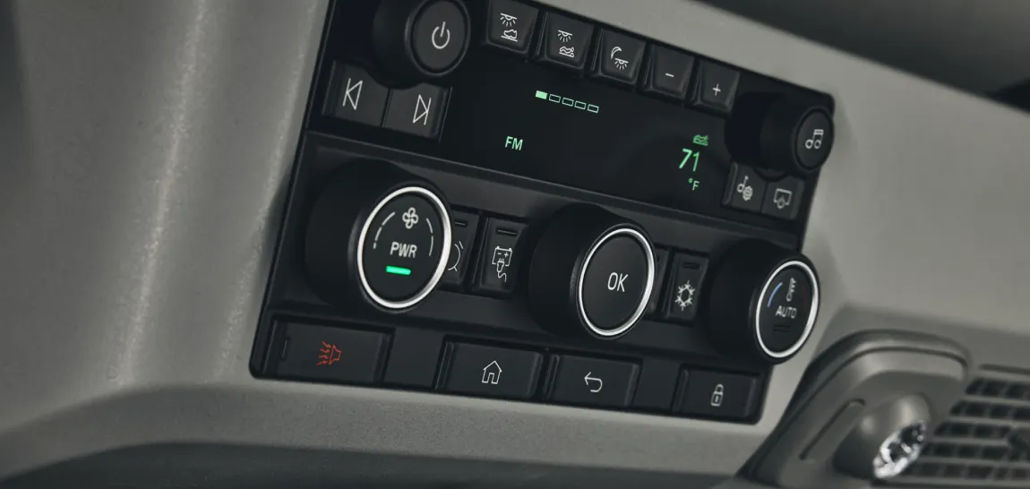
sleeper controls (lecm)
Controls for the sleeper environment: bunk climate, lighting, safety functions.
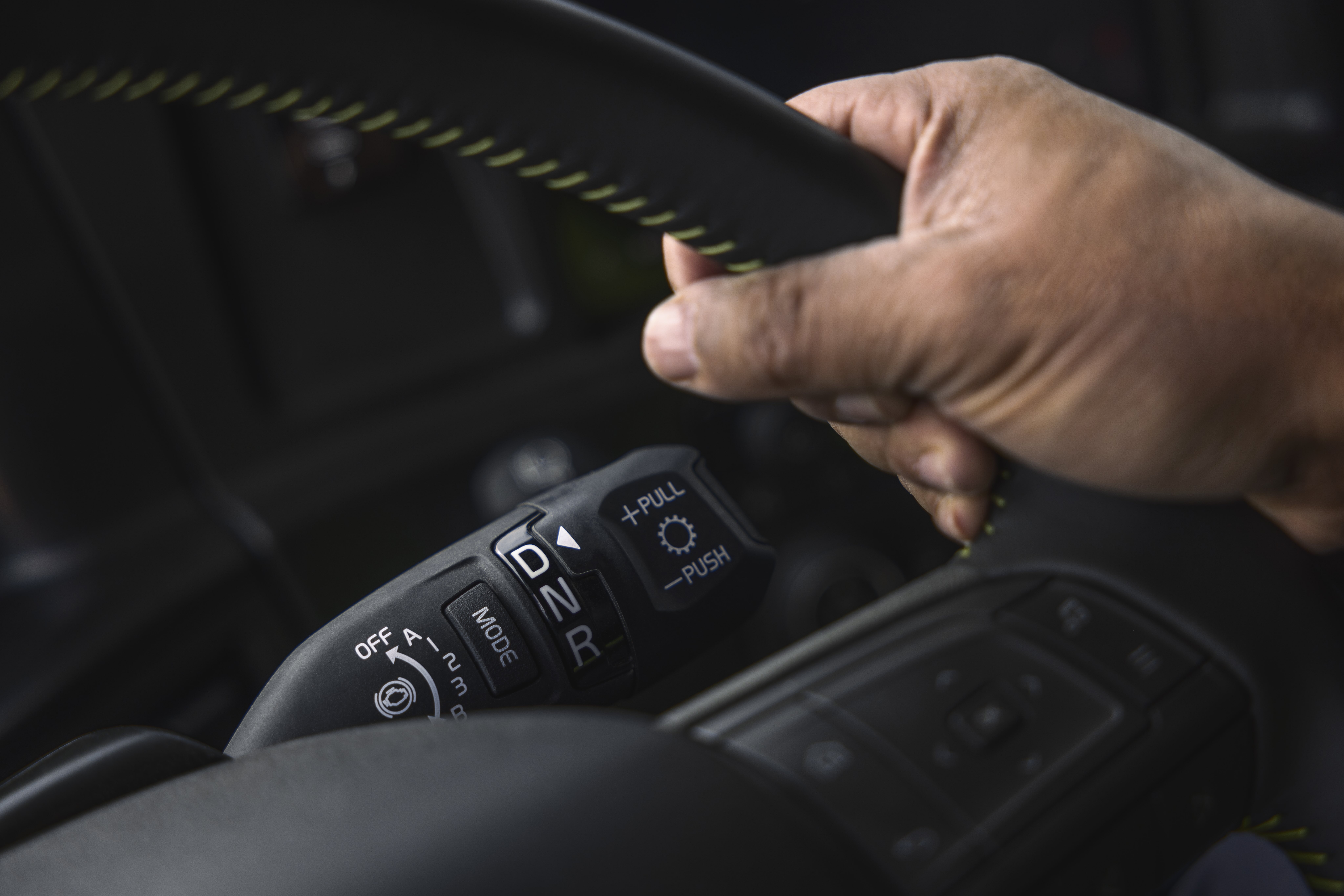
Stalks
Controls for gear selector, windshield wipers, direction indicators, high beams.
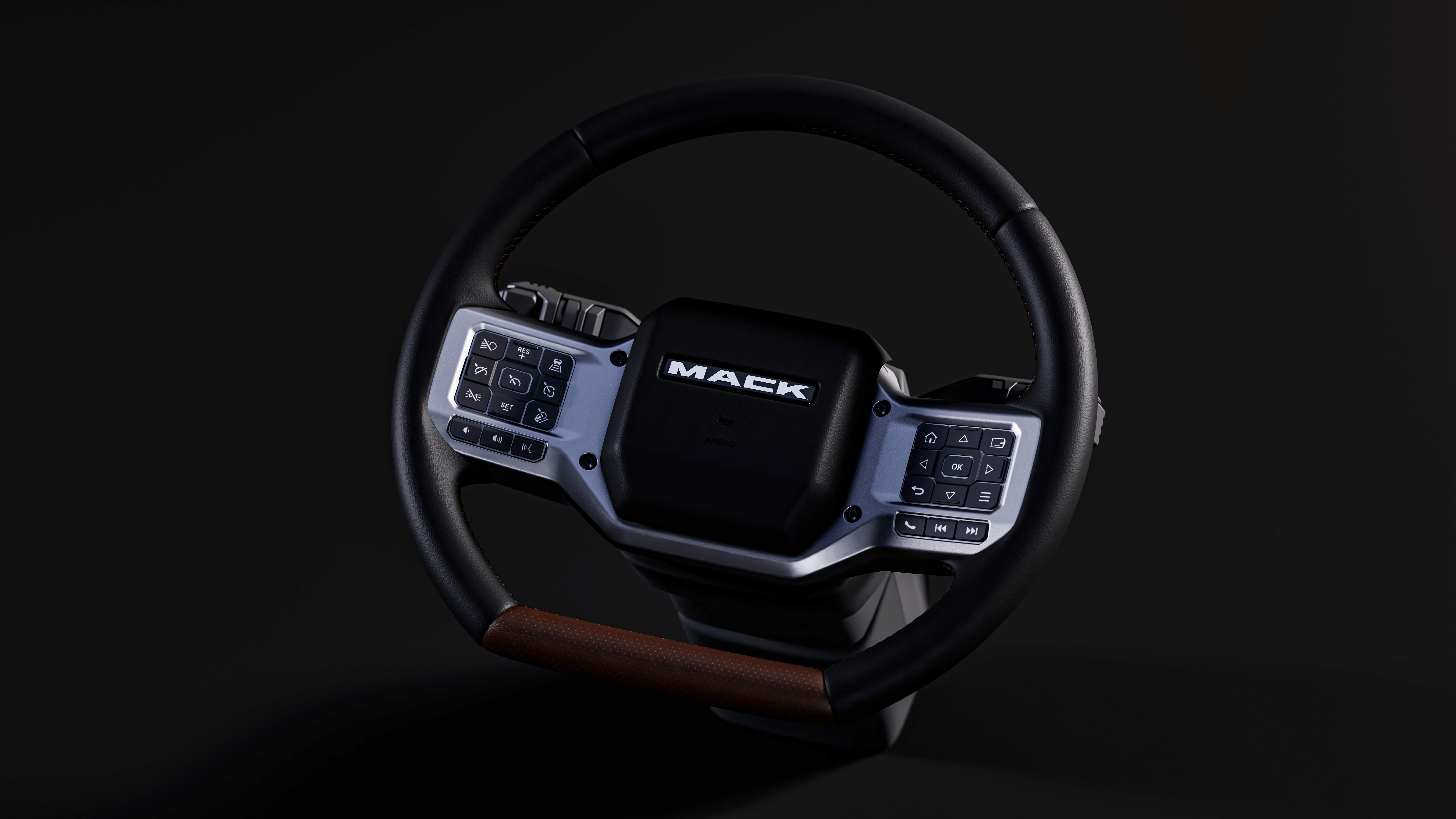
Steering wheel
Controls for radio/media, phone, instrument cluster menu, cruise control, city horn, airhorn (on volvo).

instrument cluster (ic)
Display for vehicle status, navigation cues, vehicle info, telltales, safety alerts.

EXterior light control panel (elcp)
Controls for exterior lights on truck and brightness of function feedback LEDs on all physicla controls.
The Users
Designing for professional drivers

Who they are
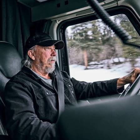
Professional american drivers with ages from 25-75. Drive solo or with a partner depending on the range. Expert users who rely on pattern recognition to operate interfaces quickly, they notice when something is wrong faster than when it's right.
Their environment
A truck cab is like their second home. Drivers spend weeks in it at a stretch working, eating, resting, communicating. The HMI is their primary interface to the vehicle and, increasingly, to logistics, communication, and route management.
Key constraints
Interactions must work while wearing gloves. Information must be readable during the day and night. Any interaction initiated while moving must be completable in under 2–3 seconds. Cognitive load is already high so the system cannot add to it.
What they need
Confidence. They need to know the right information is there when they need it, that alerts mean something important, and that the system behaves predictably the same way, every time, across every feature area.
DISCOVERY
I conducted structured evaluations across hardware, software, and driver behaviour to identify what was working, what wasn't, and where the platform fell short of North American driver expectations. Below are some gaps that I discovered as a result of my evaluations
1
Physical hardware review on intial build had poor UX
Reviewed prototype trucks for cluster readability, hardware components, and illumination. Found that reflection, ergonomic reach, and uneven lighting were real barriers that no software fix could address.
4
Some apps were unsafe to use while driving
Conducted on-road testing to measure task time and interaction complexity for infotainment apps. Found out that there was no guideline on what apps should be allowed to use while driving.
7
In-cab audio wasn't consistent in clarity or brand character
Sound is part of the HMI. Alert tones and confirmation sounds communicate system state without requiring the driver to look at a screen. Getting these right required structured expert review sessions.
2
Every software build introduced new gaps
Evaluated each SW build on the lab rig against design specifications. Deviations in layout, hierarchy, and interaction behaviour appeared consistently and fixes from one build didn't always carry forward.
5
Icons didn't always meet regulatory requirements
Audited all cluster and display icons against user comprehension, ISO standards, FMVSS/CMVSS requirements before engineering built to them.
8
Is Volvo good compared to what drivers have learned to expect?
Benchmarked overall HMI in Volvo and Mack against Freightliner, Kenworth, Peterbilt, Western Star, and International.
10
Features were being built without a driver use case
Provided UX input and usecases on new and existing features including weather, voice, widgets, and climate control reframing each from an extreme driver context rather than a general consumer one.
3
Self-report underestimates attention demand
Ran eye tracking and usability sessions across Volvo, Mack, and competitor trucks. Gaze data revealed drivers spending more time off-road on tasks they rated as easy.
6
The same feature needed different names per brand
Volvo and Mack are sibling brands with distinct identities. The same feature could carry different names across the two brands.
9
The global platform didn't account for North American drivers
Heuristic evaluation revealed inconsistent interaction patterns, untranslated terminology, and unit display mismatches that broke driver mental models.
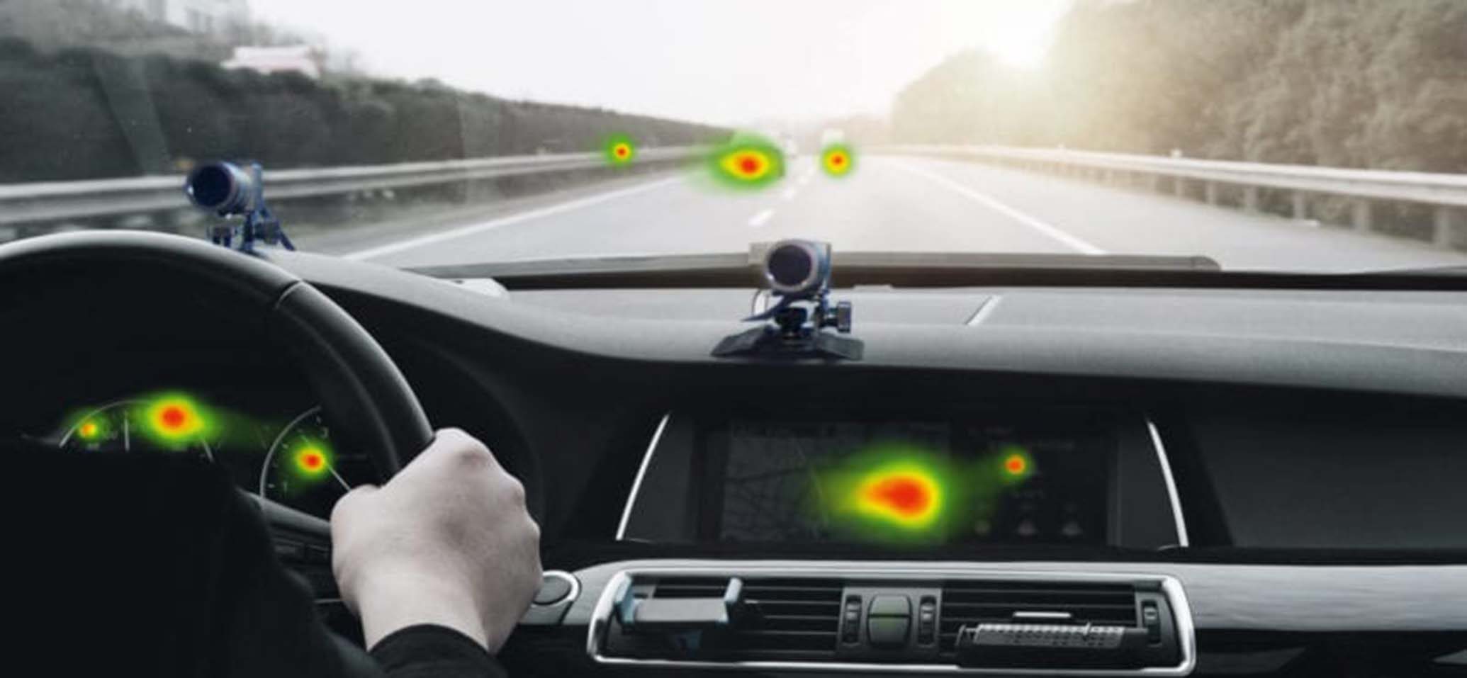

Picture Credit - Smarteye website Eyetracking system
Design Principles
01 / 06
Prioritise glanceability
If a driver has to look at a screen for more than 2–3 seconds, the design has failed. Every information hierarchy decision starts with: what does the driver need to know in one glance?
01
01
Prioritise glanceability
02
Reduce cognitive load
03
Recognition over recall
04
Enforce consistency
05
Design for scalability
06
Respect regional expectations
Insights & decisions
What the research revealed and what it produced
Each entry below is a distinct finding with its own evidence base, decision logic, and priority call. Each one produced a specific output: a hardware repositioning, a platform guideline, a cross-functional alignment, or a sprint prioritisation call. The reasoning and the standard it produced are shown together.
01
Cluster readability looked like a UI failure but the position of cluster showed it wasn't the best solution
High priority
root cause
Cluster angle directed reflection directly into the driver's line of sight, a display fix could improve contrast but couldn't change where the light went
design direction
I proposed cluster angle change and anti-reflective coating, backed by competitive evidence showing it as a solved problem elsewhere. Proposed UI changes to improve contrast
trade off
Making such a big hardware change during the initial build phase increased project budget
outcome
Angle adjustment and anti-reflective coating implemented after alignment with brands and engineering. Software contrast workaround shipped in parallel
02
Truck drivers wear gloves, have thicker fingers, or long nails all of which change how a finger meets a capacitive surface.
High priority
root cause
Button placement was designed without accounting for gloved hands, hand size variation, and nail length all affect contact precision on capacitive surfaces
design direction
I worked with engineering to reposition the display. Moving up improved access but obscured 10%+ of content. Tested front-back positioning on the dash as an alternative
trade off
Repositioning caused partial loss of ambient content visible on the display
outcome
Display repositioned for access. Content loss documented as an accepted trade-off as the obscured information remained available on the cluster
03
During testing, the wireless charger repeatedly failed to charge across 2-3 sessions. It wasn't something being evaluated, just something that kept not working.
Low priority
root cause
Surface material thickness exceeded the threshold for reliable wireless signal transmission when a thick phone case was present.
design direction
I worked with engineering to explore reduced material thickness options as a reliability fix
trade off
Minor tooling change for supplier
outcome
Material thickness reduced, restoring charging reliability for drivers using thick phone cases
04
First batch of components from suppliers came in with hotspots, uneven illumination that you simply couldn't see unless you were looking at them in the dark.
medium priority
root cause
Illumination issues revealed themselves under low-light conditions. Standard reviews happened in normal lighting, so supplier component quality and brightness inconsistencies were never caught before
design direction
I conducted night & day hardware reviews. Also defined minimum and maximum brightness thresholds high enough to remain legible in daylight, low enough at night to avoid visual fatigue
trade off
Competed with higher-priority issues for engineering and supplier attention
outcome
Consistent illumination. Brightness range defined and documented as a standard going forward. Nighttime reviews added as a permanent part of the evaluation process
05
Drivers said tasks felt easy but their eyes told a different story. The more familiar a task becomes, the less drivers notice how much effort it actually takes.
medium priority
root cause
Qualitative data was measuring how comfortable they felt, not how much attention the task was actually taking. Gaze data showed they were spending more time looking away from the road than they realised.
design direction
Based on eye tracking data, I proposed interaction pattern changes to improve the current app logic and reduce eyes-off-road time.
trade off
Running qualitative and quantitative sessions across multiple trucks including competitors made this a significantly time-intensive process
outcome
Data fed into a competitive benchmarking document and gave quantitative backing when proposing changes to engineering and product
06
Every time a software build shipped with something wrong and it wasn't caught and fixed, that wrong version became the new starting point.
high priority
root cause
North America had no dedicated review checkpoint to check each build against the design specification. The engineering team was in Sweden building for a global platform.
design direction
I reviewed every build against spec. Logged every issue with its trigger, screen state, and correct behaviour. Set up a weekly alignment meeting.
trade off
Fixes didn't always carry through to NA builds immediately because development was global. At times there was tension as development teams for cluster and display were different
outcome
Critical issues resolved within the same or next sprint. Six teams brought into alignment through shared documentation
07
Correct English and usable English in a trucking context are not the same thing. Test translations were accurate but didn't read like something a truck driver would know.
medium priority
root cause
The translation tool did its job, but it had no way to account for North America specfic terminology. As text was translated directly from swedish it was also grammatically and tonally off
design direction
I went through every driver-facing string and rewrote for North American trucking context.
trade off
A full copy review wasn't in my original scope and had to be made the case for separately. I ended up reprioritising some tasks.
outcome
All driver-facing language updated to match North American trucking conventions across the platform.
08
The platform felt inconsistent to use because it was built inconsistently. Each team made their own interaction decisions because there was nothing telling them not to
high priority
root cause
Developer teams were organised by features and worked independently. With no shared interaction reference for things like notifications, gestures, and feedback
design direction
I created a UX Usability recommendation and interaction guideline document to act as a shared reference across all teams
trade off
Some teams already had patterns built based on native android behaviour. Getting them to align retroactively required negotiation
outcome
Consistent interaction patterns and notification hierarchy documented and adopted across the platform
09
Some apps demanded more attention from the driver to do certain tasks. This had a possibility of ending up as a safety issue if done while driving.
high priority
root cause
There was no lockout framework features were being made accessible or restricted on a case-by-case basis, without legal input or a consistent safety rationale
design direction
Ran on-road testing to measure how long tasks took & how much attention they demanded. Built a lockout proposal with a clear rationale for each decision. Brought legal, brand, and engineering into alignment
trade off
Some features teams wanted accessible while driving had to be locked required difficult conversations between safety requirements and brand experience goals
outcome
Lockout framework agreed and signed off across legal, brand, and engineering
10
Volvo and Mack alerts were starting to sound the same not because anyone decided they should, but because no one had decided they shouldn't.
medium priority
root cause
Both brands shared the same underlying audio system. Without deliberate differentiation for each brand, sounds defaulted to whatever the global team produced
design direction
I set up expert reviews for each brand evaluating clarity, urgency, and brand character. After reviews, defined minimum, maximum, and default sound levels tested both at standstill and on the road
trade off
Multiple revision cycles were needed to get differentiation leading to longer timeline
outcome
Each brand's alerts revised to sound distinct from each other while still being clear and appropriately urgent. Sound levels defined and documented across both conditions
Organisational Impact
NDA restricts specific metrics. What follows is what changed.
A shared team standard
The guidelines set the minimum usability bar for features covering interactions, requirements, and in-motion constraints. Engineers and other teams referenced it directly, replacing individual judgment calls with a consistent standard.
A platform-level conversation
The notification tier framework gave product and engineering a shared model: what counts as urgent vs ambient, and what each tier means for how information is surfaced. It replaced feature-by-feature guesswork with consistent platform logic.
From 'should we?' to 'when?'
Not all recommendations were implemented immediately. But having them documented and evidenced shifted the conversation from 'should we fix this?' to 'when do we fix this?' That shift matters.
An Industry baseline
Research was consolidated into one document showing exactly where Volvo and Mack stood against competitors giving a structured, evidence-based baseline for prioritisation conversations. Used in subsequent planning conversations.

Reflection
Working on a platform used by professional drivers across continents made the stakes of getting things right very clear. Every interaction a climate gesture, a navigation prompt, an ADAS alert happens in a working environment where cognitive load is high and errors have real consequences.
The most valuable thing I took from this project was learning to treat familiarity as a signal, not reassurance. When experienced drivers said something "wasn't a problem," that was often exactly when it was worth looking more carefully. The best insights didn't come from what people told us they came from what we observed when they stopped explaining and just drove.
I also grew significantly in cross-functional and cross-cultural collaboration. Coordinating across teams in Sweden, Lyon, and India with different priorities, timelines, and design philosophies required as much communication skill as research skill.
Available for full-time roles.
Maybe it's with you.
Get in touch