

Volvo & Mack
Truck App
CONFIDENTIALITY NOTICE
Due to confidentiality & the nature of projects currently in development, I'm unable to share specific data, internal deliverables and proprietary findings from this project. All images are sourced from Volvo Group's public library. The process, methods, and outcomes described here reflect my genuine contributions.
Overview
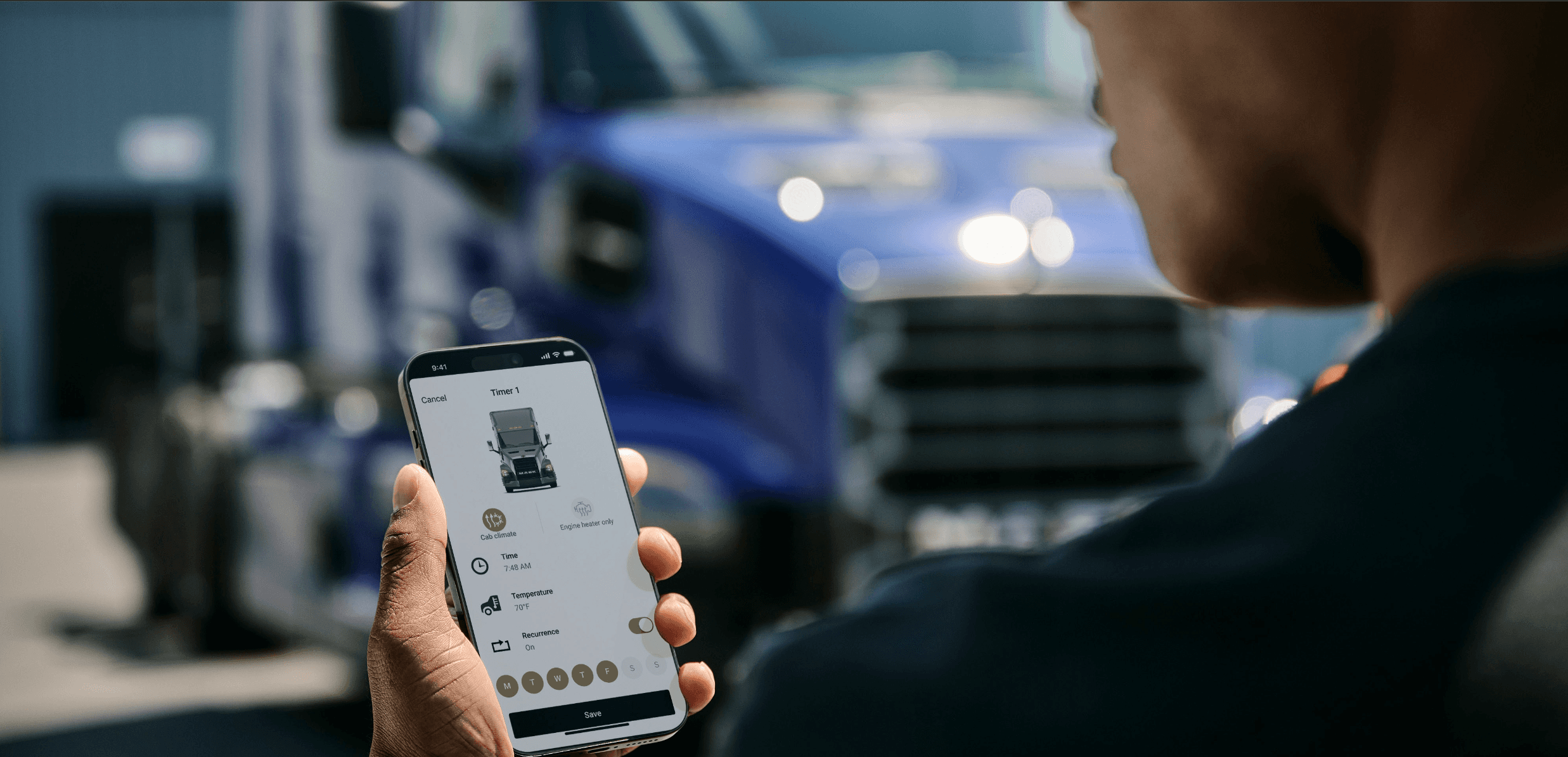
The app didn't exist. The question was what it should become
and why drivers would use it.
When the Volvo & Mack Truck App project began, there was no existing product to improve. The app had to be built from the ground up which meant the first question was "what should it actually do for a professional driver, and when?"
That question required research before strategy, and strategy before design.
The work also extended to a harder organisational problem: the app, the infotainment display, and the instrument cluster were developed by three separate teams and they didn't always agree on what an alert meant or how urgent it was. Resolving that was as much a stakeholder alignment challenge as a design one.
Role
Usability Team:
Driver Interface & Usability Specialist
Timeline
2023–2025
collaboration
Usability Team (North America), UI Designers, Engineering, Product, Global Platform Team (Sweden)
market
Volvo Trucks - USA, Canada
Mack Trucks - USA, Australia
The Challenge
How can we earn a place in a driver's day.
Mobile vs In-cab
The truck already had an HMI system. The app had to compliment it by making tasks easier or doing things the in-cab system couldn't do when the driver wasn't in cab.
01
Trust vs Convenience
For safety-critical pre-trip checks, drivers couldn't rely on a mobile app if something was wrong and they hadn't physically inspected it, they were legally responsible.
02
One product, Three teams
The app, the infotainment display, and the instrument cluster were built by three separate teams. Making the experience coherent required cross-team alignment.
03
“The challenge was figuring out when a driver would actually reach for their phone and building only for those moments.”
Team Structure
Where the Usability Team sat
Three distinct functions, each with different authority and scope. The Usability Team's position made the work distinctive.
Global (SWEDEN)
Global Platform Team
Owned the core platform, interaction model, and component library. Usability, UI designers, and developers working at the global level their decisions set the foundation everything else built on.
→
North America
UI Designers
Regional UI designers and local component owners adapting the global platform for the North American market. Output fed back to global teams for implementation.
→
My Team
North American Usability Team
Responsible for UX and usability for Volvo & Mack across USA, Canada, Australia. Held UX sign-off on all interaction proposals before engineering and owned the bridge between global platform decisions and North American driver needs.
UX authority & approval gate
Research ownership
Global-to-regional bridge
My Role
What I owned
2
Prototype Validtion studies conducted
3
User testing methods
used
20+
Professional truck drivers surveyed
4
Truck app features improved
5
Teams collaborated with
App Strategy & Roadmap
Driver Research & Testing
Cross Platform Consistency Audit
Alert Heirarchy Framework
Competitive Benchmarking
App Ecosystem connectivity
UI Approval Reviews
Requirements Documentation
UX Copy & Localisation
The Users
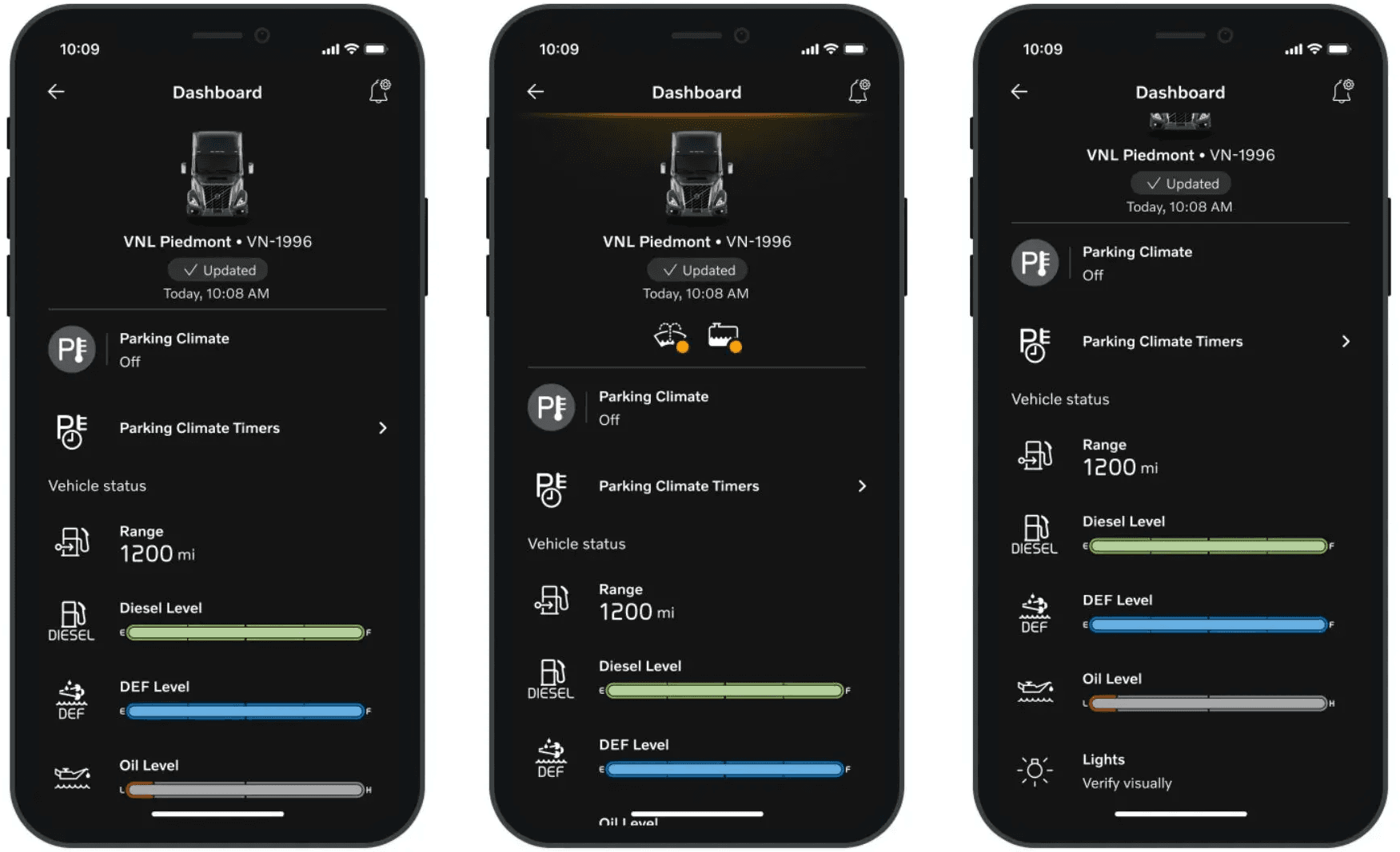
Out of the cab, priorities shift.
The drivers using the app were the same professional drivers as the in-cab HMI. But their context when using the app was fundamentally different from the in-cab system. In the cab, they were driving. With the app, they were parked, at a truck stop, or planning before departure. Different context means different needs, different time available, and different tolerance for complexity.


Who they are
Professional American drivers, ages 25–75. Solo or team drivers depending on route length. Expert users who rely on pattern recognition they notice when something feels off before they can name why.
Their environment
The cab is their workplace, but the phone is what they carry out of it. Drivers check the app before a trip, during a stop, or after a delivery never while moving. Context switches constantly.
Key constraints
Interactions happen in parking lots, truck stops, and rest areas often quickly, often in poor light. The app has to be readable, fast, and predictable. If it takes too long to find something, they won't look for it again.
What they need
Confidence that the app tells them something the truck can't before they get in, or after they've stepped out. If it duplicates the in-cab screen without adding anything, there's no reason to open it.
DISCOVERY
I conducted structured evaluations of the app prototype and driver behaviour to identify what was working, what wasn't, and where the platform fell short of North American driver expectations.
1
Drivers reached for the app at different moments than we designed for
Conducted studies after introducing the app and gave drivers tasks to complete at natural stopping points. Observed drivers through pre-departure, driving and post trip to understand when they reached for the app and when they didn't.
4
Copy, icons, and terminology didn't yet work for the North American market
Reviewed UX copy, iconography, and terminology across both brands for North American accuracy. Separated intentional brand distinctions from unintentional inconsistencies, ensured safety-critical language was standardised across both.
2
Competitors showed what connected vehicle ecosystems could look like
Evaluated how fleet and connected vehicle apps structured their feature sets and handled integration across services. Findings revealed gaps in how Volvo's apps connected to each other and directly shaped the roadmap and feature prioritisation.
3
The same alert looked different depending on where you checked
Audited alert severity, terminology, and presentation across the app, infotainment display, and instrument cluster. Documented every mismatch with enough specificity to make a case to three separate product owners.
5
The electric truck had no prior product everything had to be built from scratch
Led the full UX process for the electric app: research, function flows, use cases, journey maps per user function, UI reviews, copy, localisation, and roadmap. No prior product to reference.
The Volvo VNL Electric has been publicly announced but is not yet released in the North American market. Specific research findings, design decisions, and feature details for this platform are covered under NDA and more information will be published following the product launch.
Design Principles
01 / 05
Earn the Moment
The app only has value if drivers open it. Every feature had to justify itself against a specific moment in the driver's day: pre-departure or at a stop. If it didn't serve one of those two moments, it wasn't a feature. It was clutter.
01
01
Earn the Moment
02
Reduce cognitive load
03
Recognition over recall
04
Enforce consistency
05
Design for scalability
Insights & decisions
What the research revealed and what it produced
Each entry below is a distinct finding with its own evidence base, decision logic, and priority call. Each one produced a specific output: a hardware repositioning, a platform guideline, a cross-functional alignment, or a sprint prioritisation call. The reasoning and the standard it produced are shown together.
01
The app had no moment. Drivers weren't avoiding it, they just never had a reason to open it.
root cause
Features were designed around capability, not context. The in-cab system already handled driving needs. Nothing was built specifically for time outside cab.
design direction
Rebuilt strategy to support driver at stops and post trip. Every roadmap item had to serve one of those two or it was deferred.
trade off
Due to timeline constraint it was adopted as a long term solution.
outcome
Strategy grounded in observed behaviour. Every sequencing decision had a clear rationale.
02
Drivers had no way to know which screen to trust. The same alert meant different things depending on where you looked.
root cause
Severity mappings had been updated on the cluster side but never audited across all three touchpoints. This was because they were carry forward from previous project.
design direction
Documented every mismatch. Achieved alignment between app, infotainment, and cluster teams around a shared taxonomy.
trade off
One product owner held a different position on a single alert category. The outcome was a compromise, not perfect consistency.
outcome
Cross-platform severity directionally aligned. Remaining inconsistency documented with rationale for future teams.
03
Drivers transitioning from diesel to electric required understanding how vehicle behavior changes.
root cause
Many drivers were unfamiliar with EV unique factors, such as altitude changes, terrain, impact range and charging time. This often led to incorrect assumptions.
design direction
Prioritized route planning and energy visibility features that explained charging needs and range impact throughout a journey.
trade off
Rather than introducing advanced features immediately, I focused first on building confidence in trip planning and energy estimation.
outcome
The experience is intended to reduce uncertainty in EV trip planning by translating complex operational factors into clear, actionable route decisions.
04
Three separate apps created unnecessary friction by breaking a single user flow across disconnected experiences.
root cause
Three teams, three apps, no navigation between them. The apps were built and owned independently, with no shared navigation or context continuity between them.
design direction
Introduced short-term cross-app navigation links to allow users to move between apps without losing context, while defining long-term consolidation as a future direction.
trade off
The interim solution improved flow but didn’t resolve underlying fragmentation.
outcome
Reduced immediate user friction within existing constraints, while establishing a clear direction for eventual unification.
05
Brand differences and inconsistencies were indistinguishable in safety-critical language for the driver.
root cause
No shared standard existed to separate intentional brand variation (Volvo vs Mack) from accidental terminology drift.
design direction
Defined clear boundaries with both teams preserving brand-specific language while standardising all safety-critical terminology across brands.
trade off
Required retroactive alignment across existing implementations and teams.
outcome
Established a shared reference for terminology, improving consistency in safety language across both brands.
06
Correct English and usable English in a trucking context are not the same thing. Test translations were accurate but didn't read like something a truck driver would know.
root cause
The translation tool did its job, but it had no way to account for North America specfic terminology. As text was translated directly from swedish it was also grammatically and tonally off
design direction
Went through every driver-facing string and rewrote for North American trucking context.
trade off
A full copy review wasn't in my original scope and had to be made the case for separately. I ended up reprioritising some tasks.
outcome
All driver-facing language updated to match North American trucking conventions across the platform.


Both apps can be found on the app store and play store. Click on the icon to go to the link!
What changed because of this work
NDA restricts specific metrics. What follows is what changed.
App strategy grounded in driver behaviour
The roadmap moved from a feature list to a strategy anchored in specific driver moments. The product team had a clear rationale for every sequencing decision which made prioritisation conversations with stakeholders faster and more defensible.
Alert severity: partial cross-platform alignment
Three teams that had never aligned on alert severity now shared a documented taxonomy. The residual gap was explicitly acknowledged and logged giving future teams the context they needed to finish the job, rather than rediscovering the conflict.
Electric app year - one release with a clear value proposition
The EV-specific feature set and alert framework gave the electric app a clear job for a new driver segment with no existing product to reference. Route planning and charge status addressed the highest-consequence absence for year one, with a documented roadmap for what followed.
App strategy grounded in driver behaviour
The roadmap moved from a feature list to a strategy anchored in specific driver moments. The product team had a clear rationale for every sequencing decision which made prioritisation conversations with stakeholders faster and more defensible.

Reflection
The most useful discipline this project built was learning to ask "what is the driver actually deciding?" before asking "what should the screen show?" That shift from information design to decision support changed how I framed everything.
The electric platform work sharpened a different kind of thinking: how to design for a behaviour that doesn't exist yet. Diesel drivers have decades of muscle memory for fuel management. Electric truck drivers are building new mental models in real time and the app is part of how those models get formed. Getting the information architecture and alert strategy right was a question about what confidence in a new technology feels like, and how you design to build it.
Working across engineering, UI design, and product teams spanning Gothenburg and North America also developed my ability to hold a strategic point of view while staying close enough to implementation to know when a decision was drifting away from the driver's actual need. The value of UX strategy isn't in the document. It's in being in the room when the tradeoffs are being made.
Available for full-time roles.
Maybe it's with you.
Get in touch