Unscreened Connections
Overview
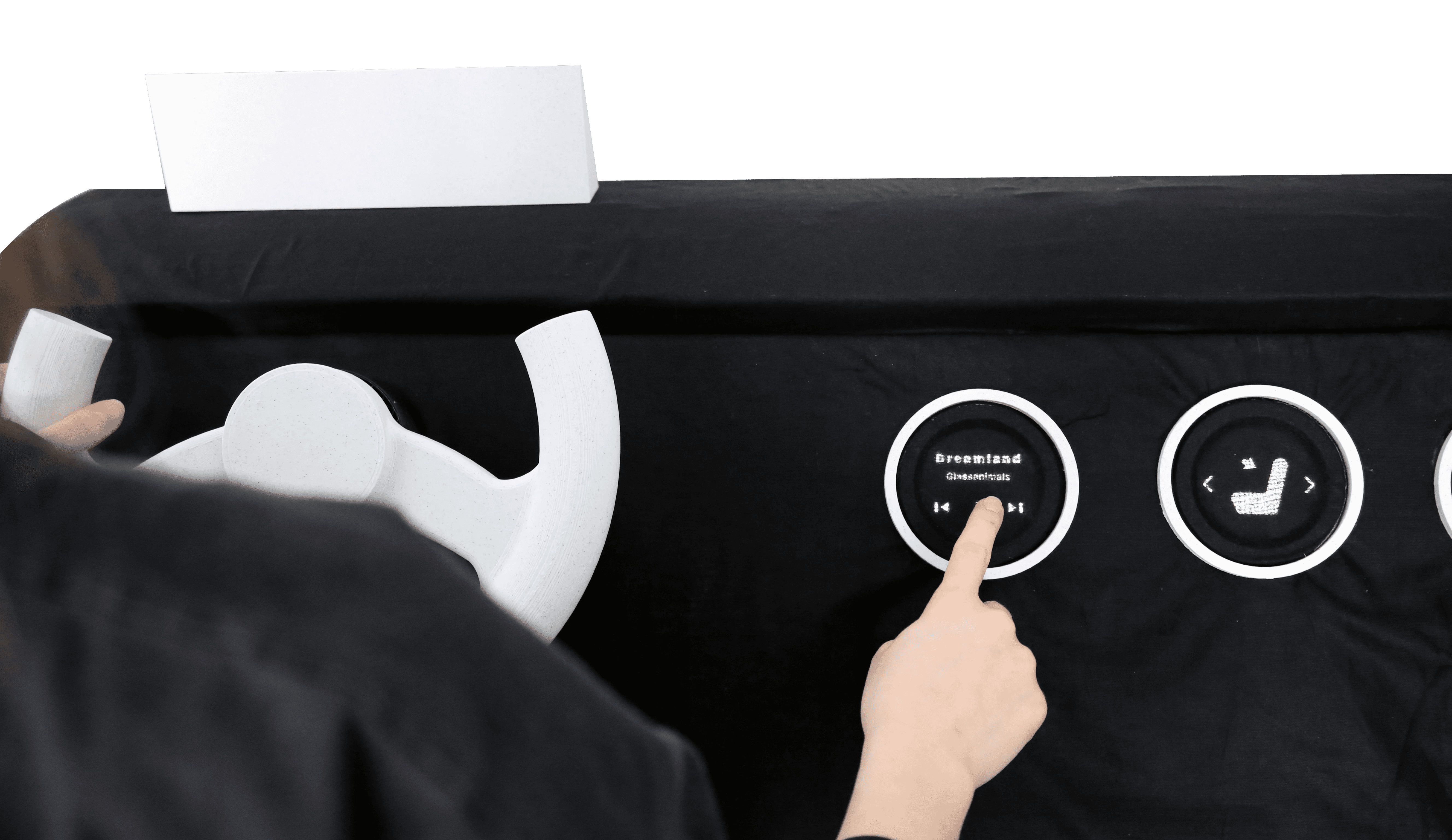
What would human vehicle interaction look like if we designed for connection and the right level of engagement?
My masters thesis challenged the screen-first direction of automotive design and built an alternative grounded in touch. Dashboards that were once mechanical and tactile have become large touchscreens. The experience of driving is not primarily a digital one it is sensory, physical, and emotional. For people who love to drive, who see it as a skill and a space of their own, the touchscreen takeover doesn't add to the experience. It erodes it. Screens add visual clutter and cognitive load to an environment that already demands full attention.
Role
UX Research
Testing
Interaction Design
Prototyping
Timeline
2022–2023
methods
Literature review
Expert interviews
12 user interviews
Ethnographic shadowing
3 rounds iterative prototyping
client
MFA Interaction Design thesis (Graduated with Distinction)
The challenge
More screen, more automation, less of what drivers valued.
Cognitive & Sensory Overload
Large touchscreens with complex menus create visual and cognitive overload in an environment that already demands full attention. Drivers are managing two cognitive environments simultaneously.
01
De-skilling & Disengagement
Driver-assist features reduce the cognitive engagement that makes driving meaningful producing monotonous, understimulated, fatigued driving. Drivers described feeling "numb," "bored," and "deskilled."
02
Lost Emotional Connection
Touchscreens provide no physical feedback. The loss of tactile interaction severs the emotional bond between driver and car, the same bond that gives possessions their symbolic value.
03
"People don't get in the car to be entertained. They rely on those spaces to not be overwhelming. This is why screens could hurt people more rather than help them."
Nicole Gayney — Psychology & Automotive UX Expert
research lens
A broad aim, grounded in the drivers who feel the problem most acutely.
I deliberately chose to research drivers diagnosed with ADHD. Cognitive overload, distraction, de-skilling, and the need for the right level of engagement affect every driver but they are most visible at the edge. Designing for the edge is how you find what's broken at the centre.
The inclusive-design framing ran through the secondary research too. Tactile interaction isn't just preferable for attention-affected drivers, it's preferable for anyone whose eyes need to be on the road. Designing trustworthy, engaging in-car experiences now is what builds the driver trust required for autonomous technology later.
Primary Research
12 user interviews (semi-structured and unstructured), purposive + snowball sampling.
Expert interviews with Nicole Gayney (psychology and automotive UX) and Clemens Conrad (Executive Experience Director, Vectorform).
Shadowing sessions with 3 participants while actively driving to observe behaviour.
→
Secondary Research
Literature review spanning cognitive science (situational awareness, distraction research), design theory (calm technology, meaningful experiences, inclusive design), automotive interaction taxonomy, and material/tactile design trends.
Sources triangulated with primary findings before synthesis.
secondary research
Visual scene complexity and peripheral objects significantly affect situational awareness in driving environments. This provided empirical support for the claim that adding screen complexity to the dashboard creates measurable safety cost not just user preference.
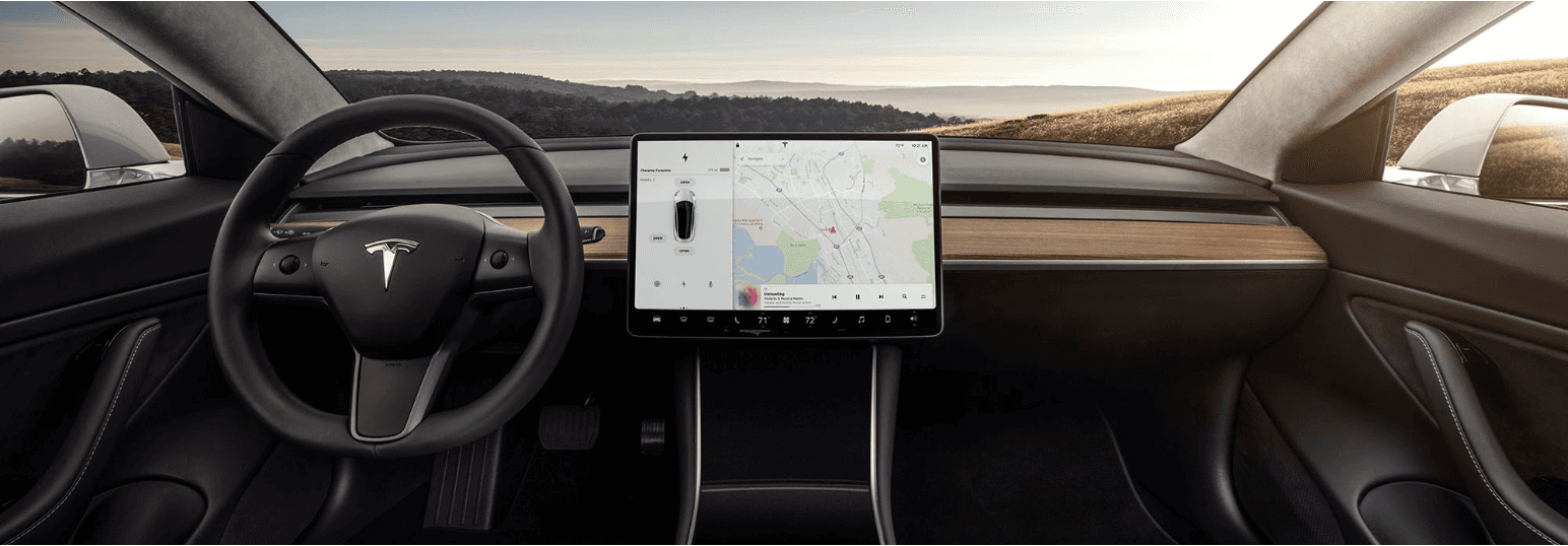
Technological innovation in human car interactions has led to the replacement of physical buttons with touch screens, resulting in more complex and functional interactions between the driver and the car’s user interface.

The three types of car interactions are primary, functions directly related to driving such as the instrument cluster; secondary, functions take a little more time to accomplish, such as knobs; and tertiary, functions require high cognitive load, such as the infotainment system.
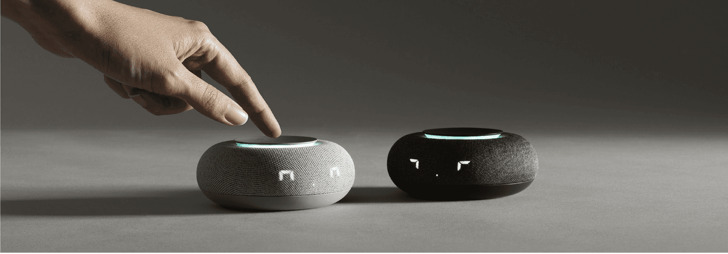
WGSN’s Connected forecast states that as our lifestyles become more digital, touch remains an innate need. Designs that appeal to the senses, with tactile products that feel warm, even at their most hi-tech will feel human.
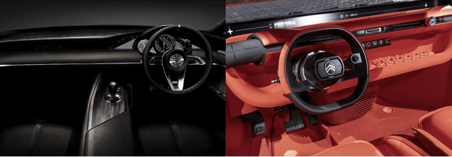
The Mazda Vision Concept and Citroen’s Ami One Concept provide inspiration for minimalist car interiors with essential controls and digital displays for necessary information, such as speed and battery level.

CSIKSZENTMIHALYI & HALTON in THE MEANING OF THINGS:
Objects hold symbolic value and emotional attachment, influencing how users experience their possessions. The loss of tactile, physical controls in vehicles isn't just a usability issue it severs the sense of relationship with the machine. This framing gave theoretical grounding to what participants were describing emotionally when they said older cars felt more "theirs."
Research Data
How consistently each problem theme was named by every participant.
0
4
8
12
Phone over in-car screen
Emotional connection to
driving
Prefer physical controls
Cognitive / sensory
overload
De-skilling from
automation
Distrust automotive tech
Manual transmission
preferred
Cognitive Engagement Spectrum
The design target: the right kind of engagement
Automation pushed drivers toward under-stimulation and screen clutter toward over-stimulation. The design lives in the middle.
Under-stimulation
Bored · Passive · De-skilled
Design Target
Engaged · Present · In control
Over-stimulation
Distracted · Overloaded · Unsafe
insights
01
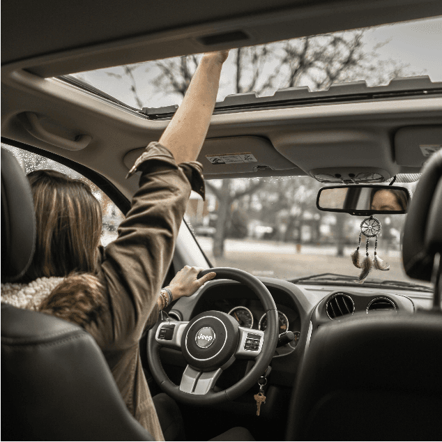
Driving is emotional, a space of their own
It was more than transport. It was alone time, emotional processing, freedom a place to be present without external demand.
02
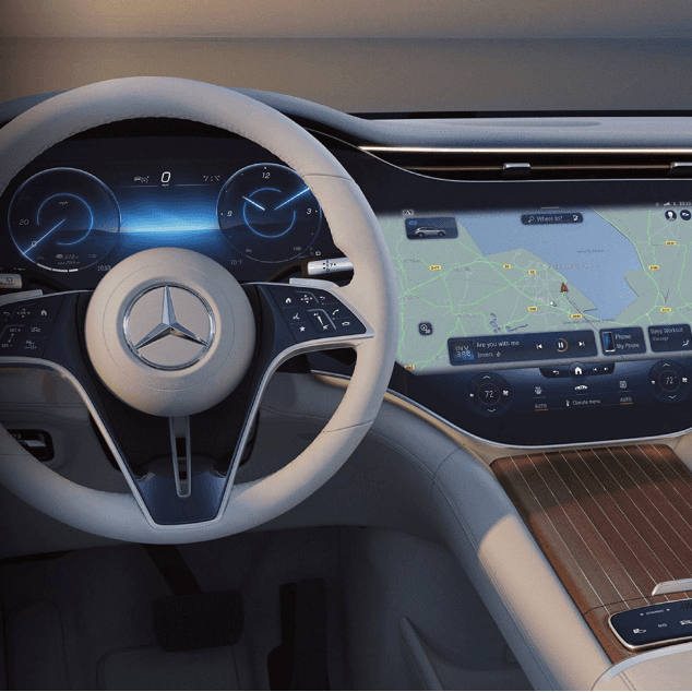
03
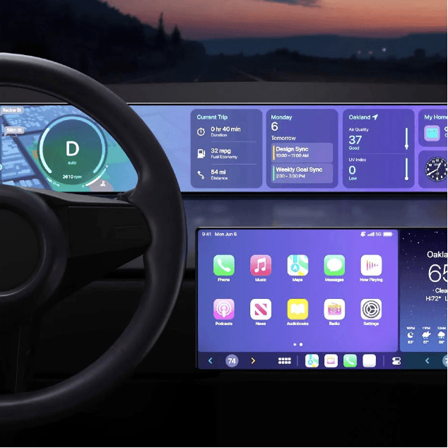
persona
Three user archetypes informed by research
Research findings were distilled into three personas representing distinct driving contexts and emotional needs. Each persona has a corresponding scenario that illustrates how the product would fit into their life.
Efficiency under pressure
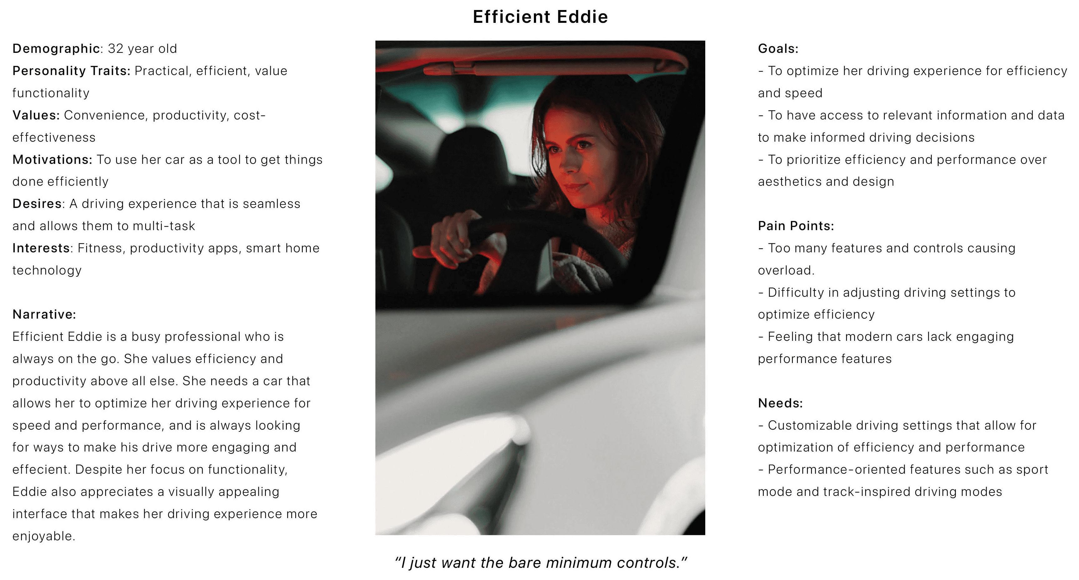
Efficient Eddie
"Any extra cognitive step in a moment of pressure is a safety failure."
Speed
Reliability
Eyes on road
Values control & simplicity
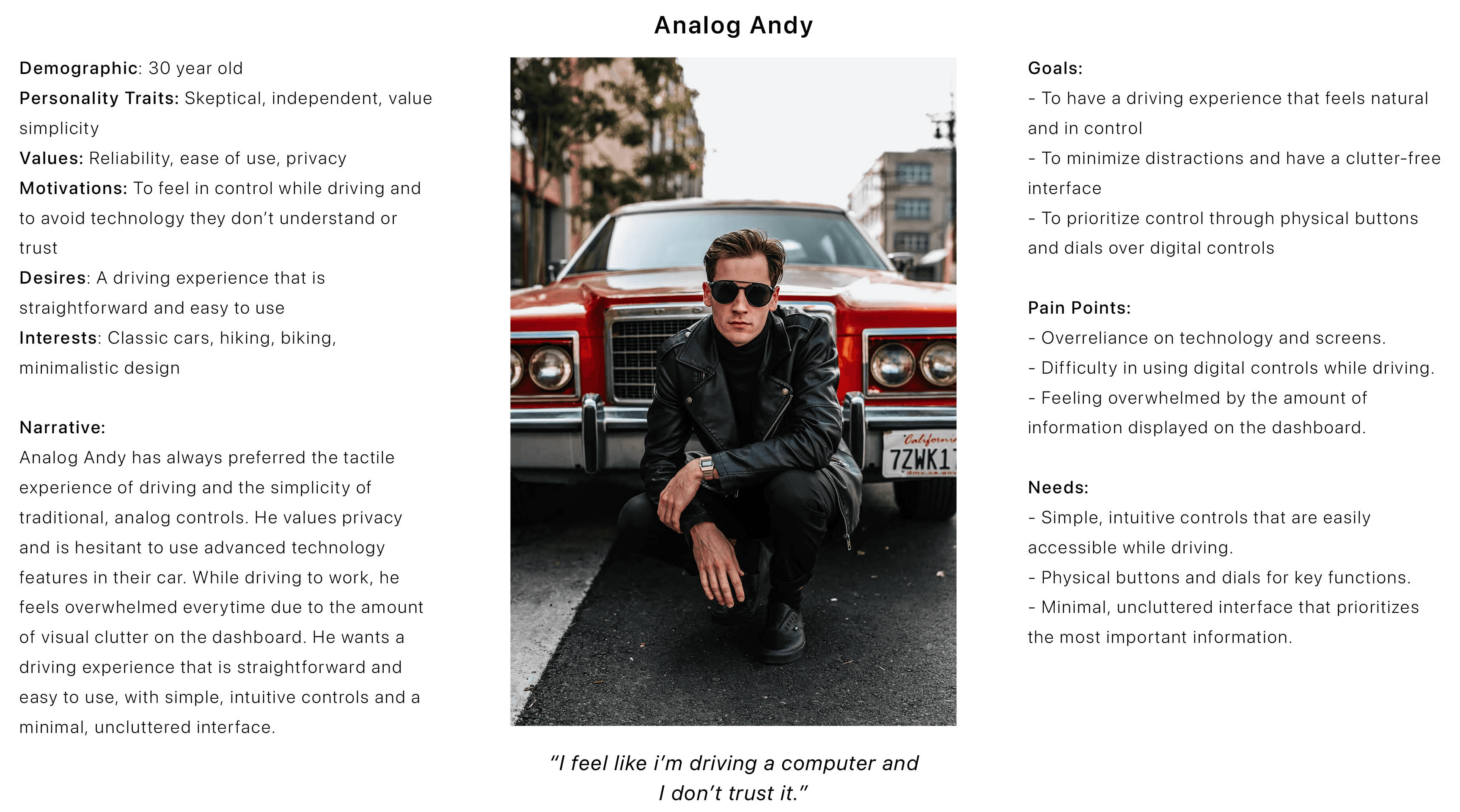
Analog Andy
"I want fewer, better controls not more options behind screens."
Physical controls
Distrust of tech
Simplicity
Drives to connect & decompress
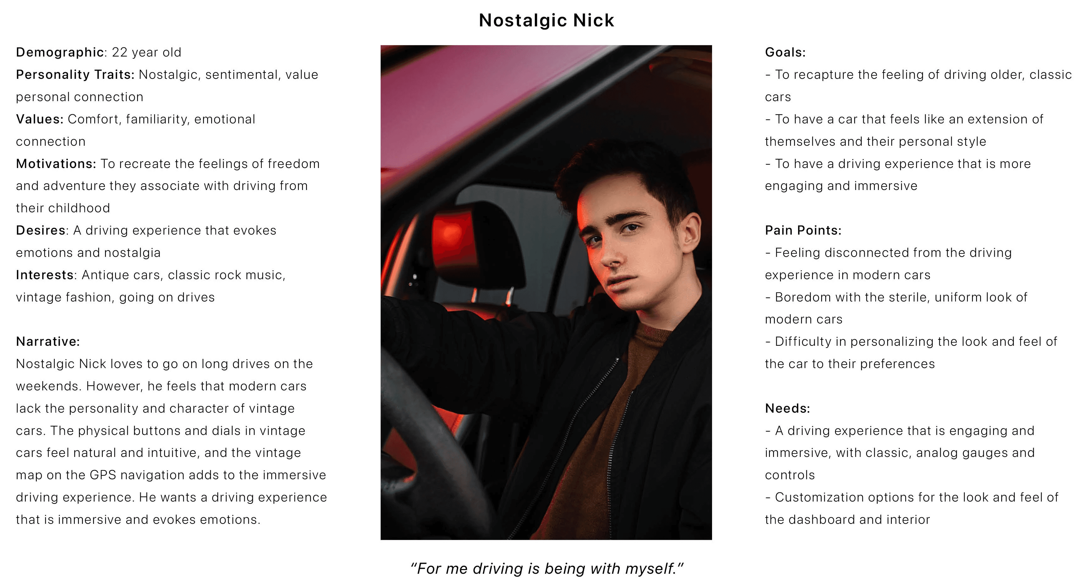
Nostalgic Nick
"The car should feel like a companion, not a device.
Emotional connection
Presence
No distraction
Synthesis
From three questions to one design direction.
What is not working? How to improve it? How to achieve it?
Distrust and Visual Clutter
Design for meaningful, engaged mobility
The middle ground
The problem wasn't technology itself. It was technology competing for attention in an environment where attention costs lives. Instead of designing a better touchscreen, I deliberately explored whether physical interaction could restore driver engagement while reducing cognitive load.
A better-designed infotainment screen. Clearer UI hierarchy on the existing dashboard. Voice control as the primary alternative. All of these left the visual channel as the primary medium for car interaction which research showed was the problem, not a suboptimal implementation of it.
Design Principles
Four principles that anchored the concept.
01
Engage without distracting
Hold the right level of driver attention, not so minimal to produce boredom, or so demanding it competes with the road.
02
Touch before vision
Every action that can be completed through touch should not require the eyes. Eyes belong on the road.
03
Reduce visual demand
Every element in the driver's visual field is a cost. The cluster shows only what's necessary. The dashboard recedes rather than demands.
04
Personalise, don't overwhelm
Different drivers need different controls. The system should serve each driver's specific needs without exposing all drivers to every option.
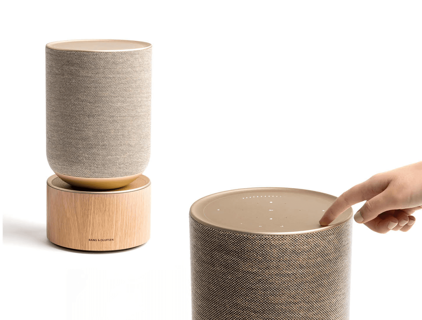
Leveraging the emotional power of touch that conveys anger, fear, love, disgust, gratitude, sympathy through materials to establish a physical and emotional connection between the user and the car.
A personalized driving experience by allowing users to customize the car interface and prioritize relevant functions based on their needs and preferences, focussing on hyper-personalization.
Ideation
Three concepts, compared on function.
The comparison was functional: which concept best served the research findings and created the right level of engagement without adding cognitive load?
One concept was finalised after getting feedback from users initially surveyed
Selected
Physical Neomorphism
Rejected
Single Universal Control
Rejected
Modular Knobs

I took inspiration from the neomorphism trend and thought of implementing it in a physical sense. It stemmed from the idea of having digital elements in the physical space. Interesting as a material direction. With 3 knobs as base configuration driver curates their own set per need. After getting user feedback, I decided to further develop this idea.
storyboard
Storyboard creation was another tool to visually represent the user journey in a way that was both engaging and informative. Creating storyboards, mapped out the user journey in a step-by-step manner, highlighting key touchpoints.
Scene 01 - Andy
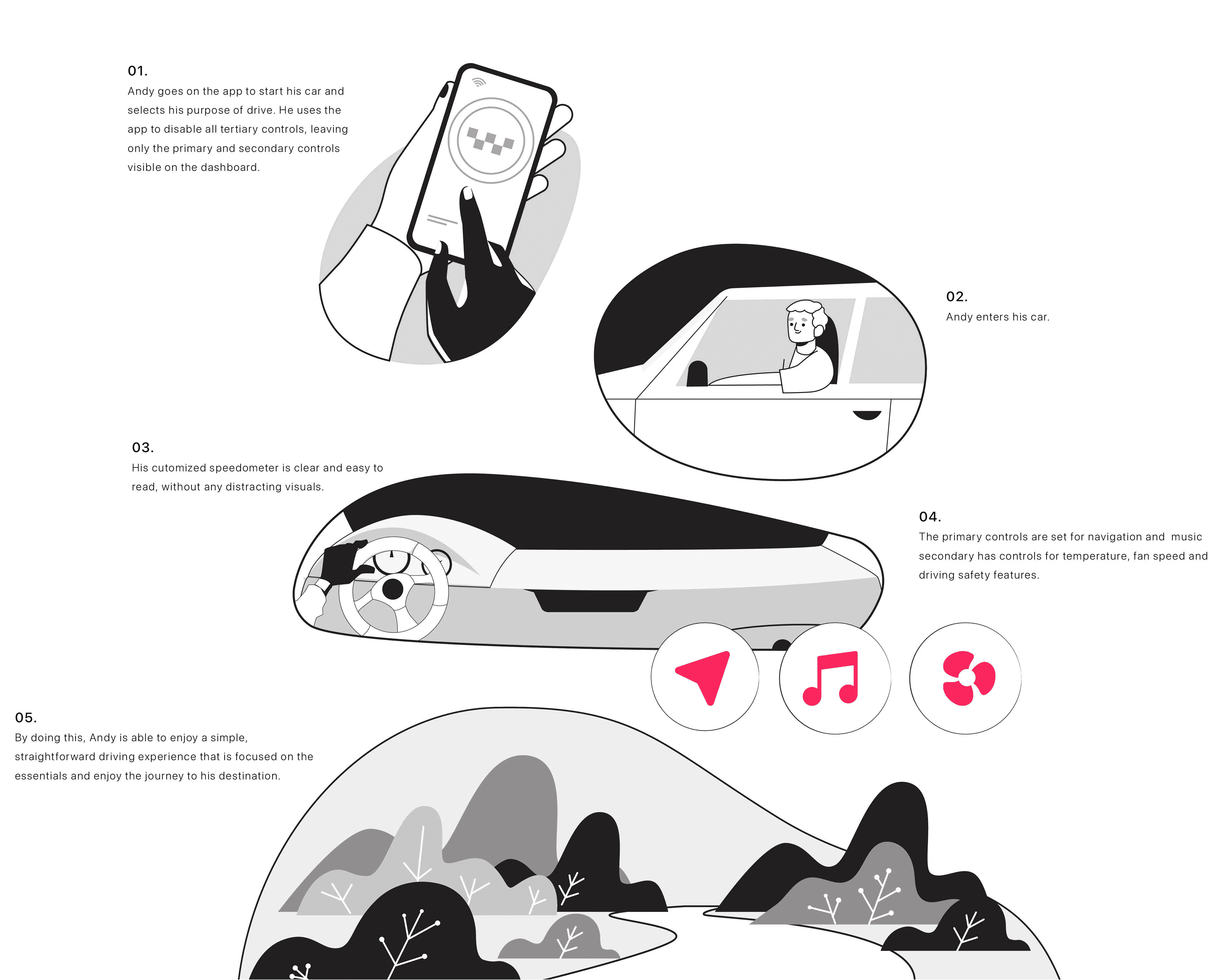
Andy is planning a roadtrip and wants to have a stressfree and enjoyable one. He only needs controls that are directly related to his driving purpose. He customizes his roadtrip driving mode and assigns music and navigation controls. Before starting his roadtrip, he activates the mode.
Scene 02 - Nick

Nick decides to go on a long drive after a long school day to spend some time with himself. He wants a drive to be alone with his thoughts and get the space he needs. During the drive all he wants is to feel connected with the car as if he’s a part of it. Nick is looking forward to enjoy his me-time.
Scene 03 - Eddie
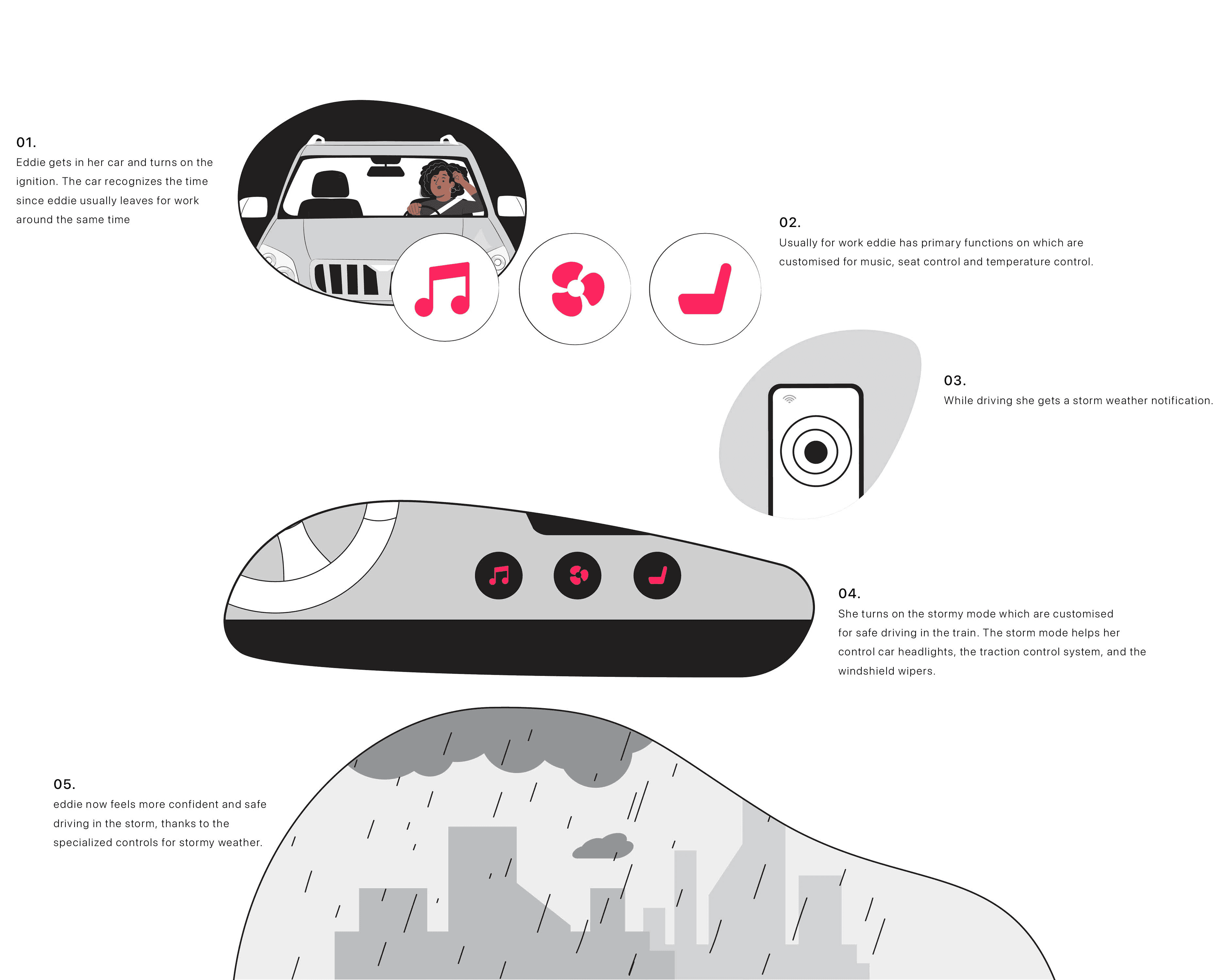
Eddie is running late for a meeting and needs to arrive at her destination as quickly and efficiently as possible. She needs to be able to be efficient and take quick actions during emergency situations like stormy weather. She looks forward to a safe drive.
prototype, testing & iteration
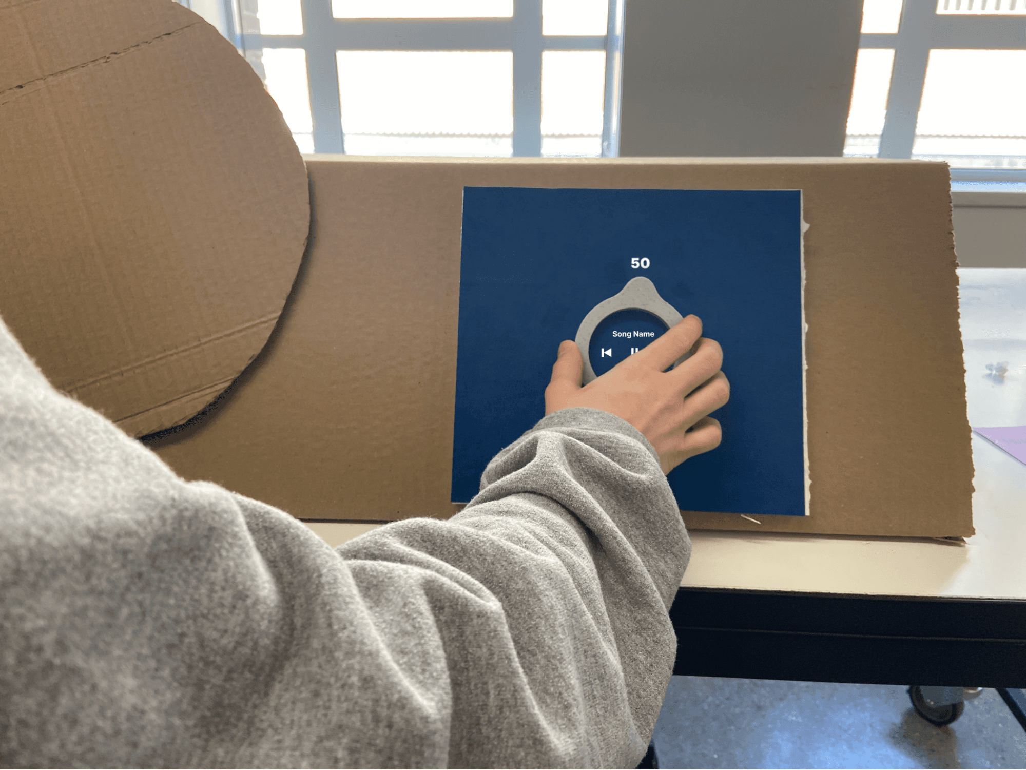
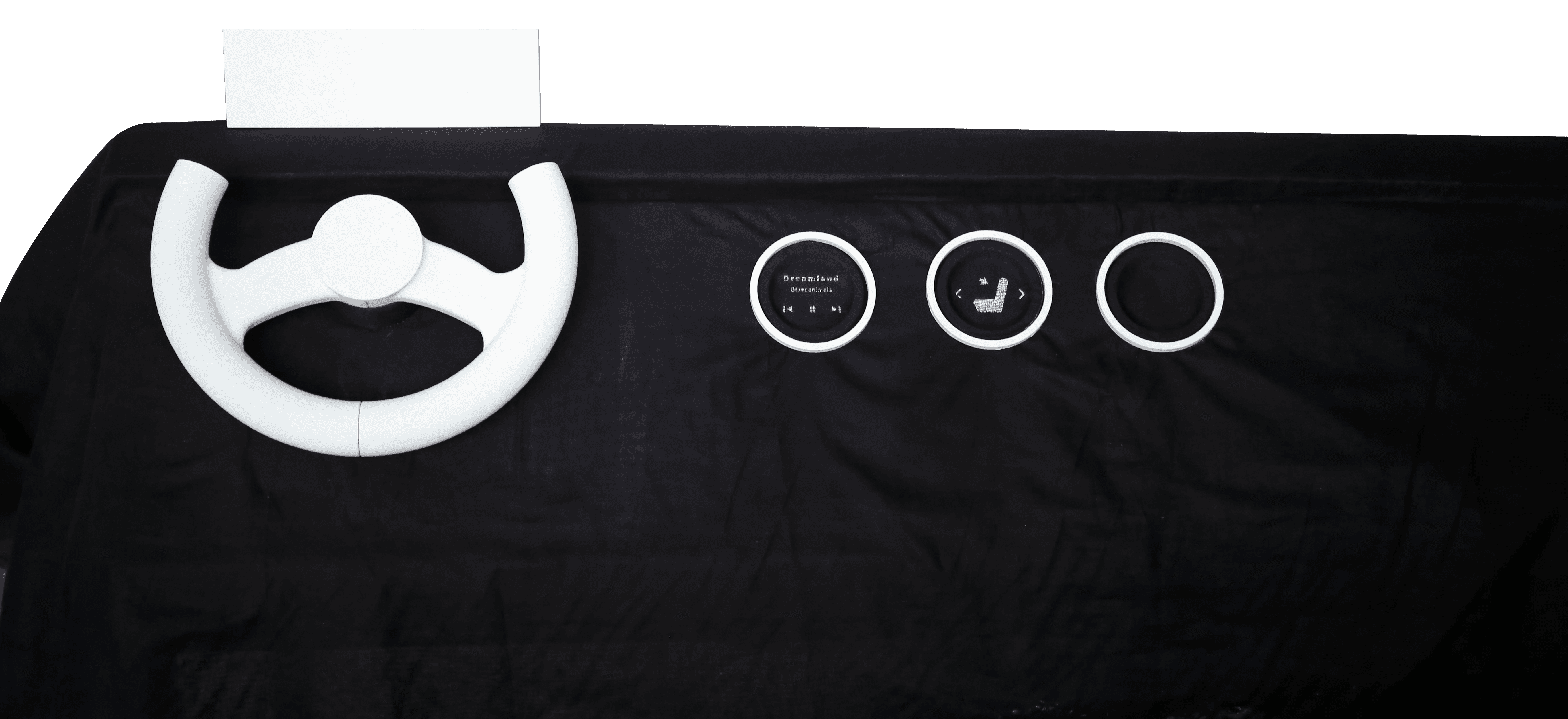
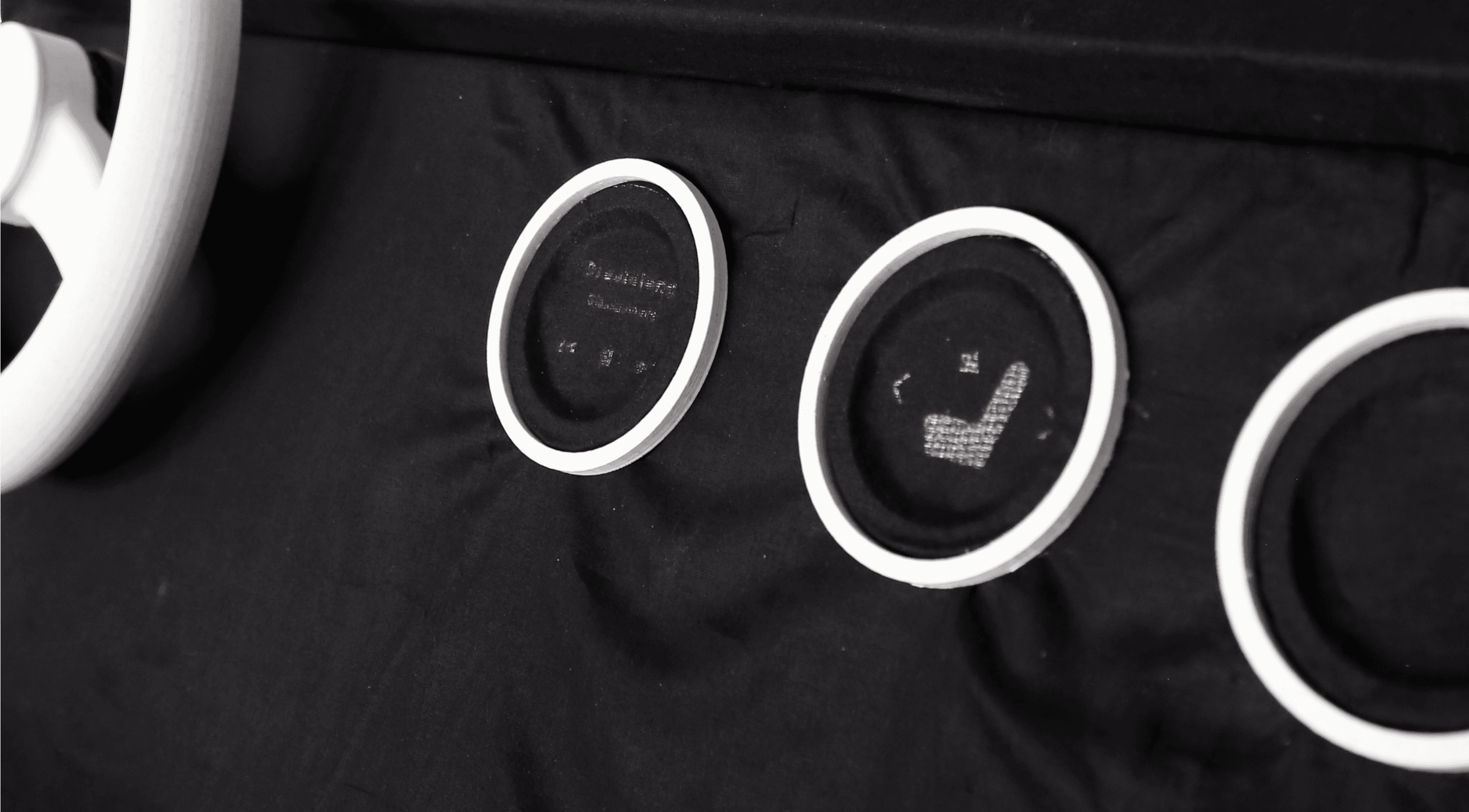
After finalising the concept, prototypes were created and tested with users to make informed decisions and validate with the target audience. Through an iterative process a final solution was reached. For testing and validation sessions a prototype using cardboard, foamboard, fabric and 3d printed controls was made to replicate the dashboard.

Moodboard



Card sorting helped me understand how users classify functions and the average number of controls users would have for one type of primary function. This exercise was done with 8 users.


Tested out different types of knob shapes based on usability and reach as well as material explortion.


During testing, users were asked to complete specific tasks and provide feedback on the app as well as the dashboard controls. The tasks included customizing the control and driving modes, adjusting car settings, and adding new modes. The feedback from users was analyzed and used to refine the design and improve the user experience.



final design
Meet Eddie

“Driving is being with myself and not having to see everything at once, it lets me do that."
This is Eddie. She loves driving and usually likes to drive because it let’s her have her own emotional space. She’s had a long day of school and wants to go on a long drive. We’ll now see her journey about how she uses the new HMI.
As its winter she goes to the app to add her new mode customize controls.
Next she gets into the car and only sees what she has customized the mode to be.
Alternatively If she ever changes her mind about the controls she can just to it as easily.
Mobile Screens
Driving modes
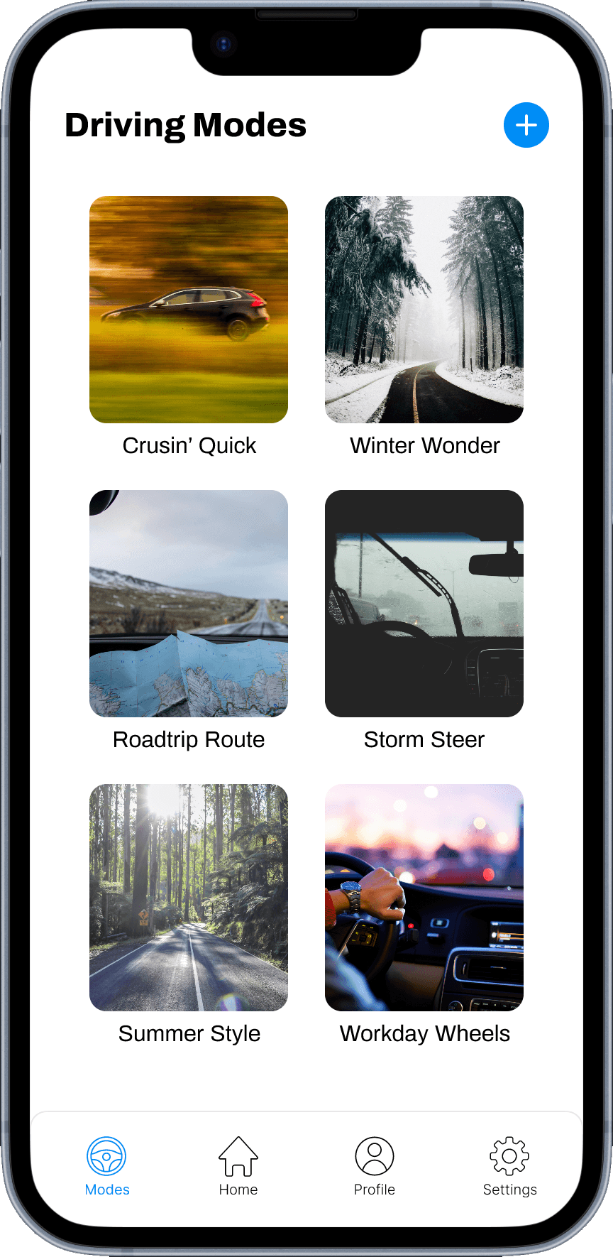
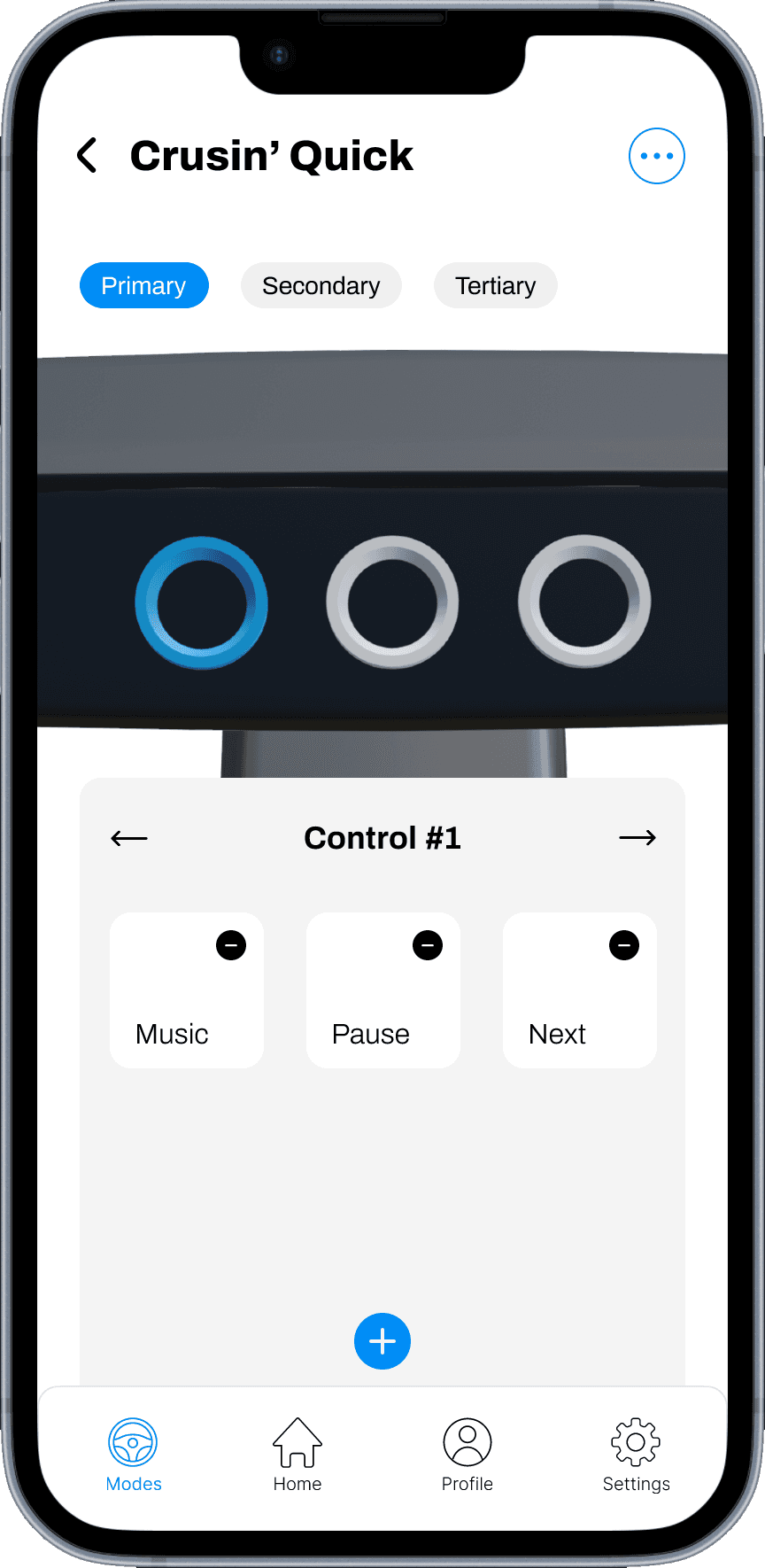
Customizable driving modes allow users to tailor the car’s functions to specific driving scenarios with greater control and the ability to adjust settings to match their preferences.
Mode details
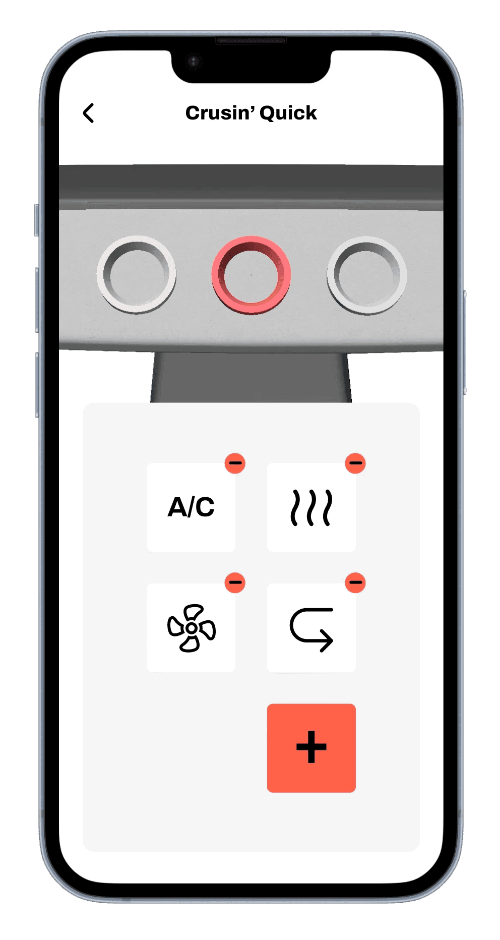
In mode details, users can assign controls and categorize them as primary, secondary, or tertiary based on their frequency of use, minimizing distractions and cognitive load.
Profile
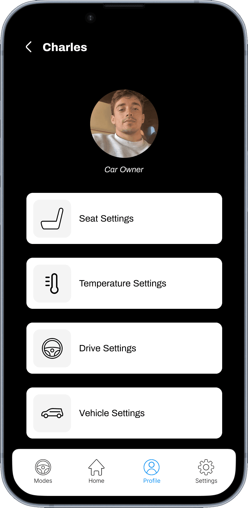
Individual profiles in the car allow multiple drivers to personalize their preferred temperature, seat, vehicle settings, which will be automatically activated whenever they start the car, providing a seamless and enjoyable driving experience for all.
Reflection
This project asked a question I kept returning to throughout: what does it actually feel like to be in control of a car, versus just operating one? The hardest part was resisting the pull toward adding more. Designing fewer screens, fewer defaults, more intentional touch required constant justification, both to myself and through testing. Each round pushed me to be more precise about what "simplicity" actually meant for different drivers, because it wasn't the same answer for everyone.
Hyper-personalization emerged as the through-line, but I think there's still more to explore in the material and tactile layer. The concept gestures at the emotional power of touch, but translating that fully into a testable, buildable form was where I felt the edges of what a thesis project could hold. That's the thread I'd most want to pull further.
Available for full-time roles.
Maybe it's with you.
Get in touch