IND|
Behance
NEXT
Communicating Electric
Overview
A modular design system which gives easily digestible information about electric vehicles to the younger generation by bringing the content to them in small bite sized pieces. The goal is achieved by using and leveraging existing tools to expand the scope and conversation about Electric Vehicles, thereby shifting the focus from long form content to short form content.
The challenge was to look at the painpoints concerning the EV buying and owning process among potential users. Insights from user research showed that the younger generation (aged 22-30) were unaware about the EV market and general information regarding the same. Available resources are usually present information in a long-form content and overwhelming format. This creates an information gap for the younger generation as they prefer getting information from social media and small bite sized pieces.
ROLEUX Research
Testing
Ideation
UI Design
TEAMCourtney Shinaberry
(Communication Designer)
Samantha Mantua
(Communication Designer)
CLIENTConsumer's Energy
TIMELINE2022
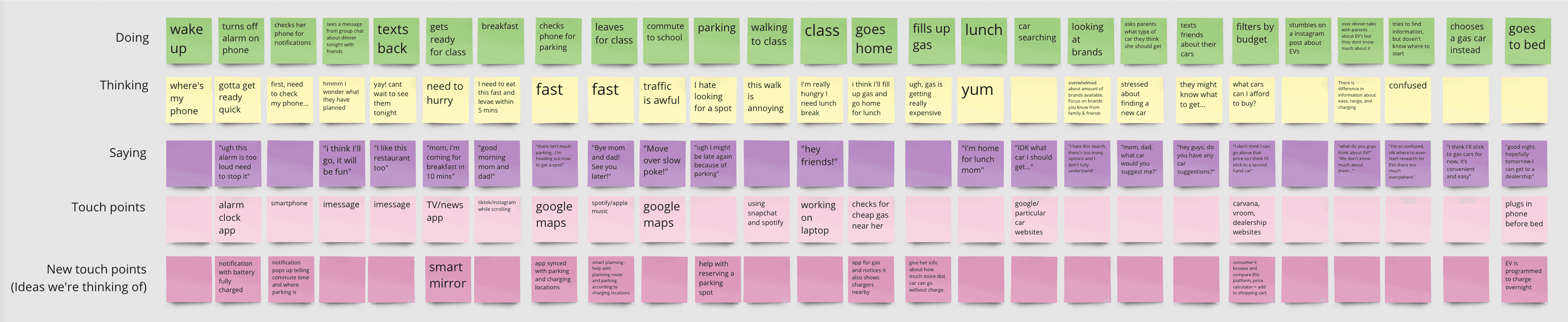
Research
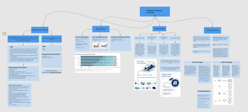
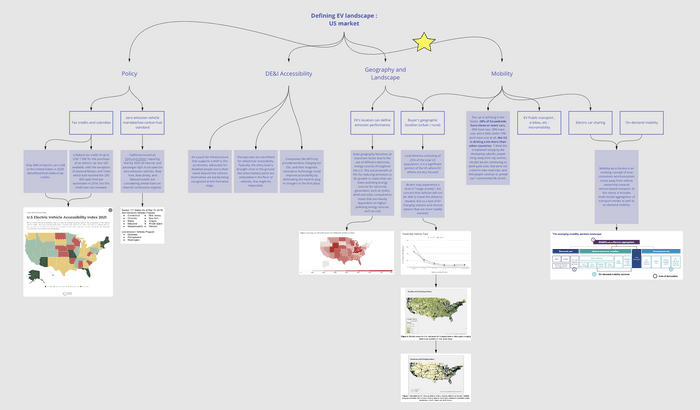

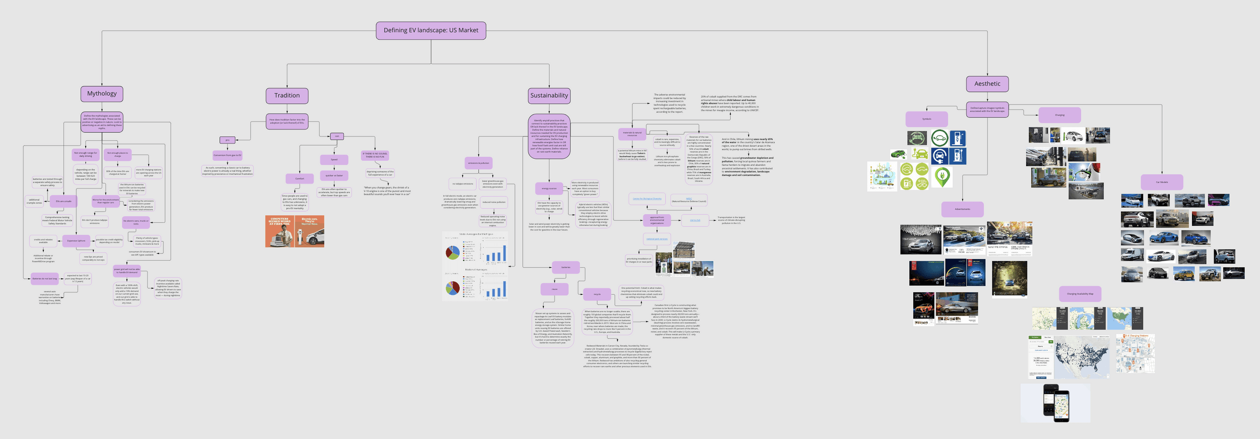
Research and user interviews helped narrow down the challenges, opportunities and insights regarding the EV market.
01.
What do young adults want in a car?
03.
What are the assumptions involved?
05.
What do they think about when buying a car?
02.
What are young adults’ opinions on electric vehicles?
04.
What are their preferred transportation methods?
06.
What tools, services and tech do they use to get information and move around?

Personas

People are hesitant to get EVs because they don’t know much about them, especially with the myths of EVs creating extra confusion.
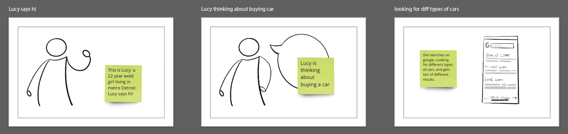
Our goal is to give younger people more easily digestible information about EVs by bringing the content to them. The team also aims to add Consumers Energy into the car buying process.

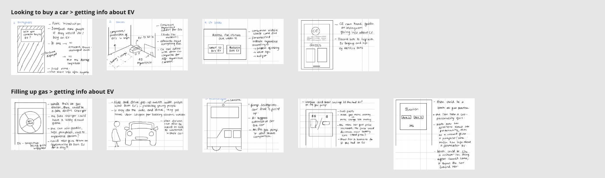
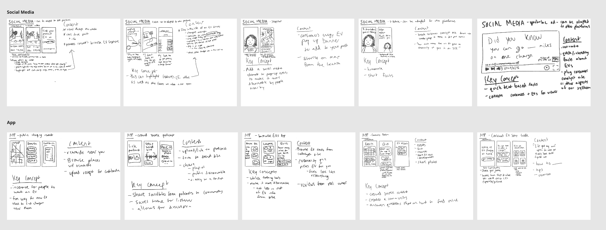
Preliminary idea, lo-fi prototype & testing
After brainstorming on the preliminary sketch concepts the team finalised on a solution that lets the information come to the users. The concept is about creating a real world experience (on walls, windows, in a space) showing the benefits of an EV and connect EV with Consumers Energy.


Some of the feedback points from our testing sessions
01.
The interactive information wall could be more graphical and interesting.
03.
Have more playful content.
02.
Use of language that is more casual and geared towards the target audience.
04.
Leverage Consumer’s content in an engaging way.
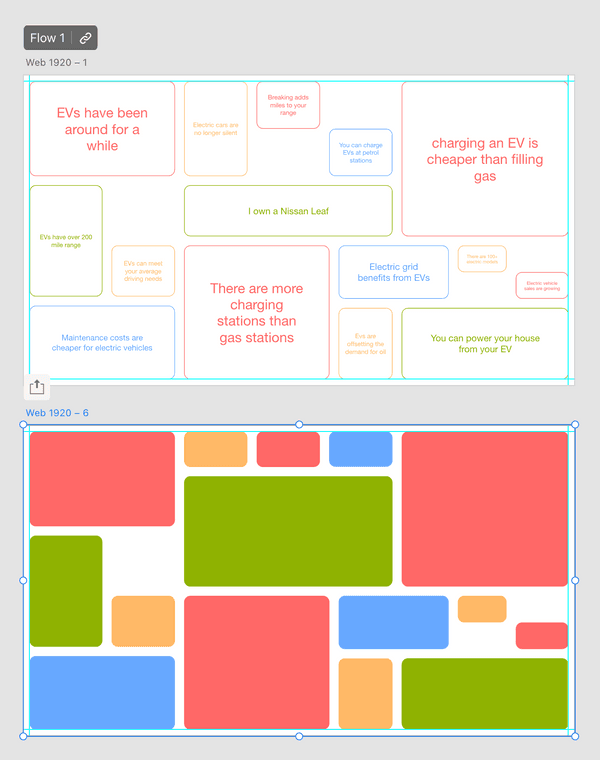
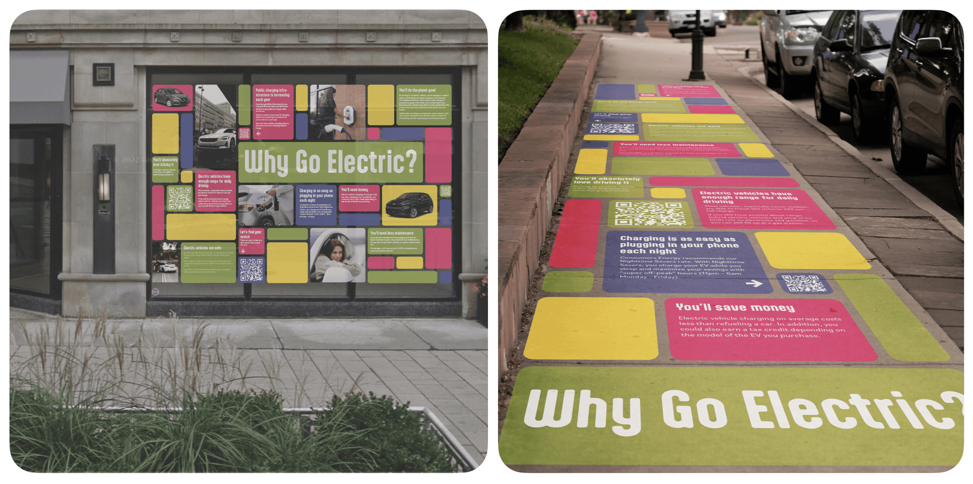
Final design

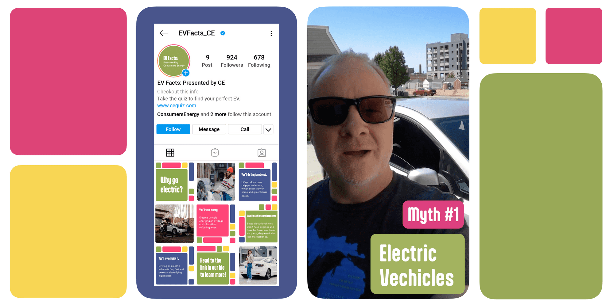
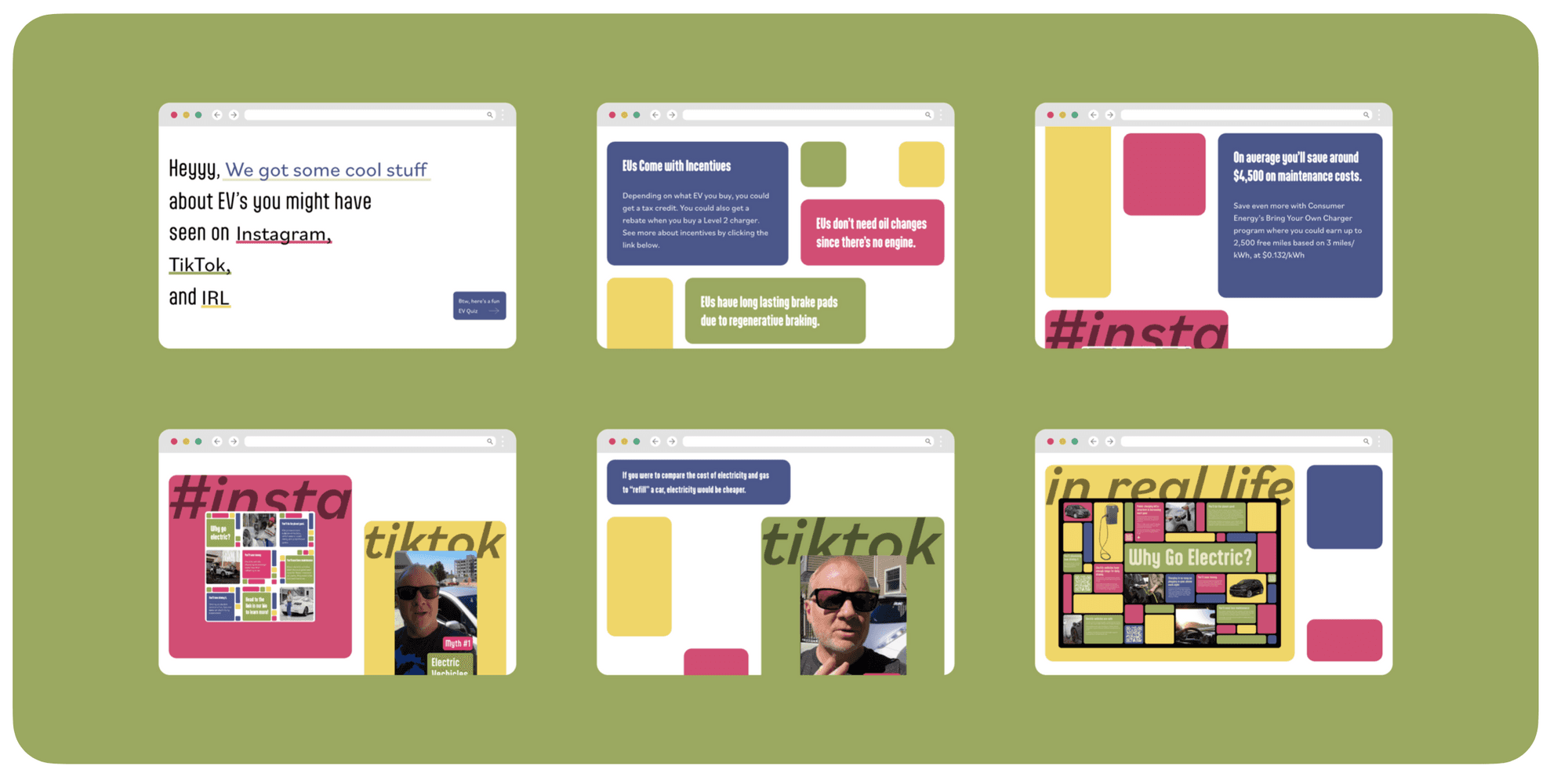
Our solution was a 4 touchpoint system
TIKTOK
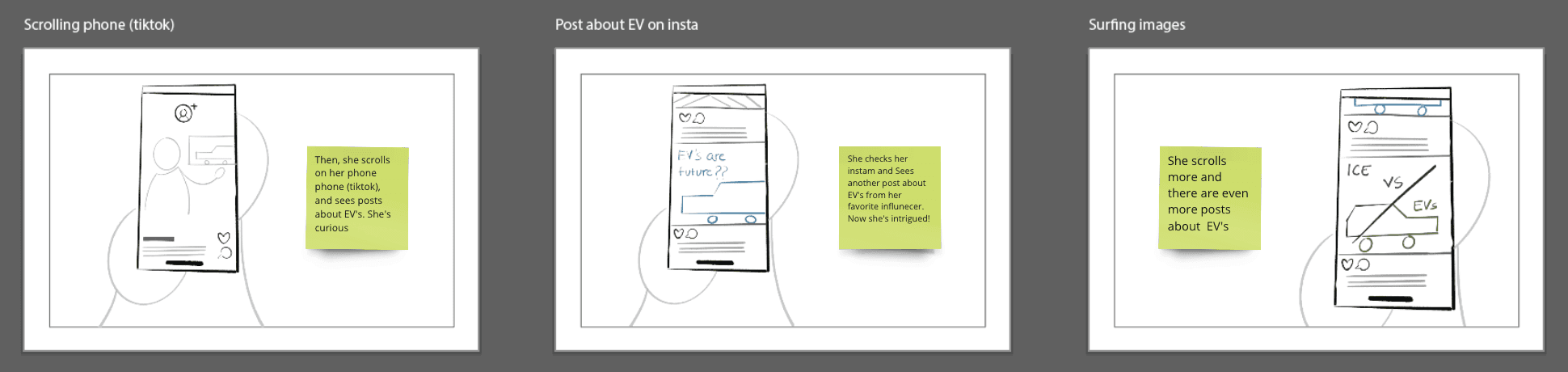
Circling back to our persona, Lucy who is in search of an EV, is scrolling through TikTok like usual.
She’s on her for you page, which curates new content for her to discover. A video about EV myths shows up. She learns that used EVs can be under $10,000. This peaks her interest, as her roommate, Stephanie, is in the market for a new car. She views the profile and discovers there’s a whole series of videos on EVs that she can watch.
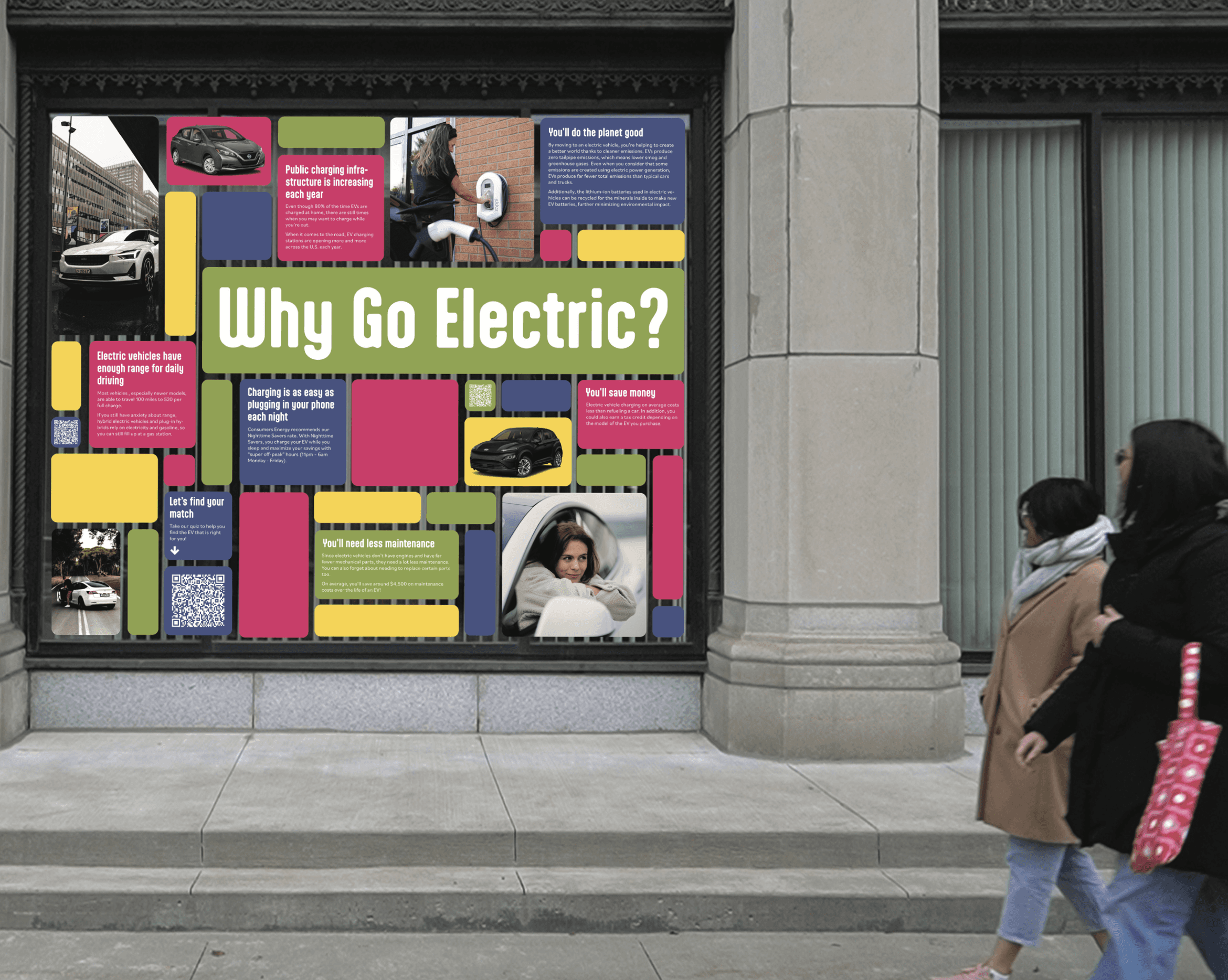
POSTER WALL
Lucy and her friend Stephanie are out walking to lunch, when they see a window display. Lucy scans the qr code to come back to later.
WEBSITE
Lucy is then back at her apartment, looking at the website she discovered through the window display. She thinks there is a lot of helpful information and shows the site to Stephanie.
QUIZ
Stephanie decides to take the quiz to find her perfect EV. They have fun answering the casual, conversational questions and Stephanie is left with three good options and contact info for owners of each car that she can reach out to, to ask questions.


Reflection
This project taught me that the real design challenge wasn't creating new content, it was meeting people where they already were. Early research made it clear that the information gap wasn't about a lack of EV resources; it was about format and context.
Working across a multi-touchpoint journey: TikTok, a physical poster wall, a website, and a quiz pushed me to think about consistency in a new way. Each touchpoint had to feel self-contained, but cohesive enough to build a narrative together. Testing feedback kept asking us to go lighter, more casual, more playful, and learning to design for a tone.
If I were approaching it today, I'd want to spend more time validating the physical touchpoint in an actual spatial context, and push the quiz results further toward a longer relationship between the user and Consumer's Energy, rather than ending at three car recommendations.
Available for full-time roles.
Maybe it's with you.
Get in touch