Enhancing Behance
Overview
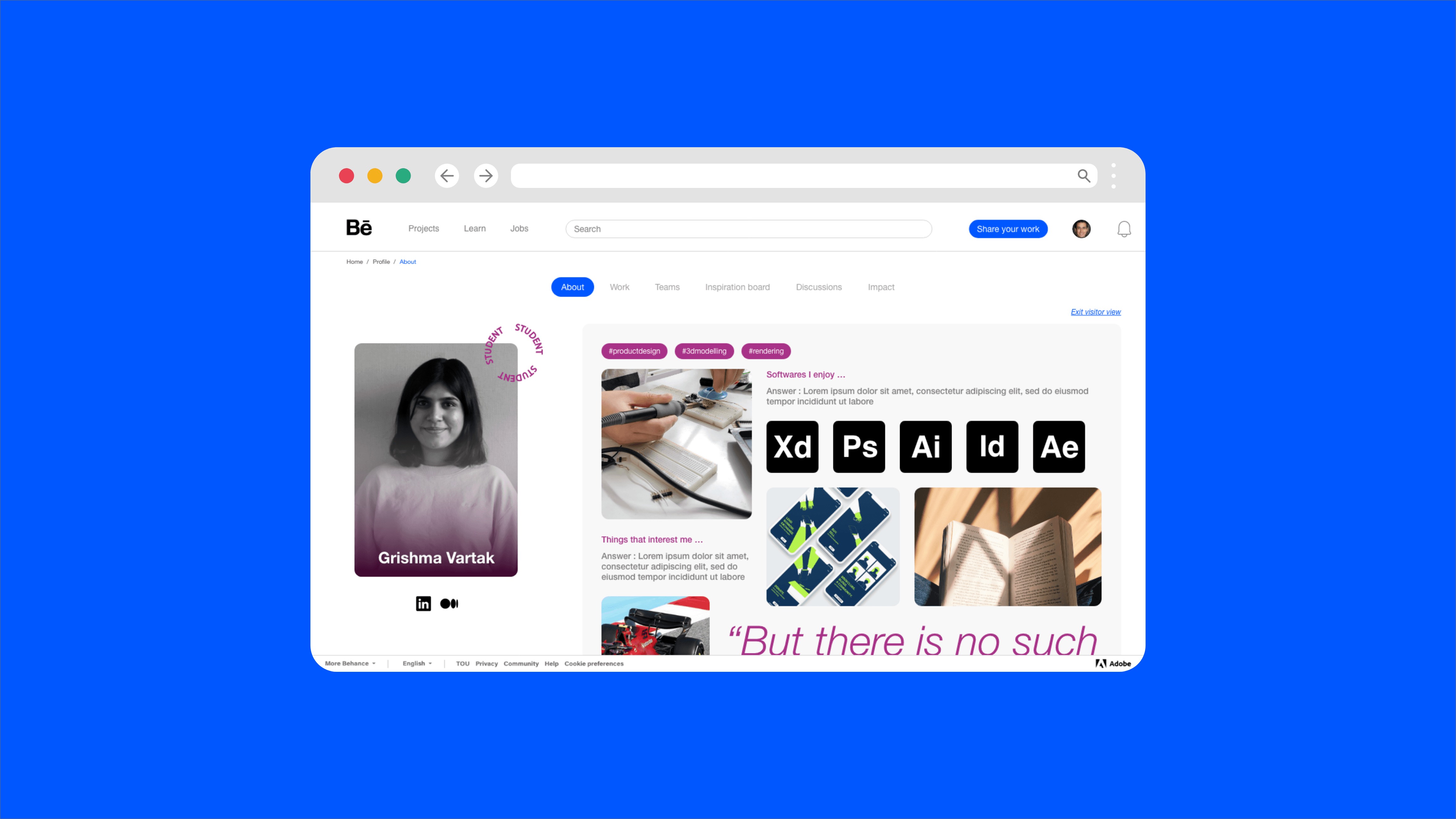
A make-over of the Behance website that leverages the community aspect of the creative field, using it to provide support and enhance connection between creatives. This redesign of Behance also provides a way to add personality to a creative’s portfolio while also being consistent with the platform’s design language.
One size (doesn’t) fit(s) all? Aspiring creatives often turn to Behance as it's free to use and present their projects/portfolios but fail distinguishing themselves from others on the same platform in the process. They’re at the phase in their career where getting feedback on their work and learning new skills is something high on their priority list. Due to the diversity of creative fields, connecting with other creatives and getting feedback gets tricky.
ROLEResearch
Testing
Ideation
UI/UX Design
TEAMPersonal
Project
CLIENTAcademic Project
TIMELINE2022
Research
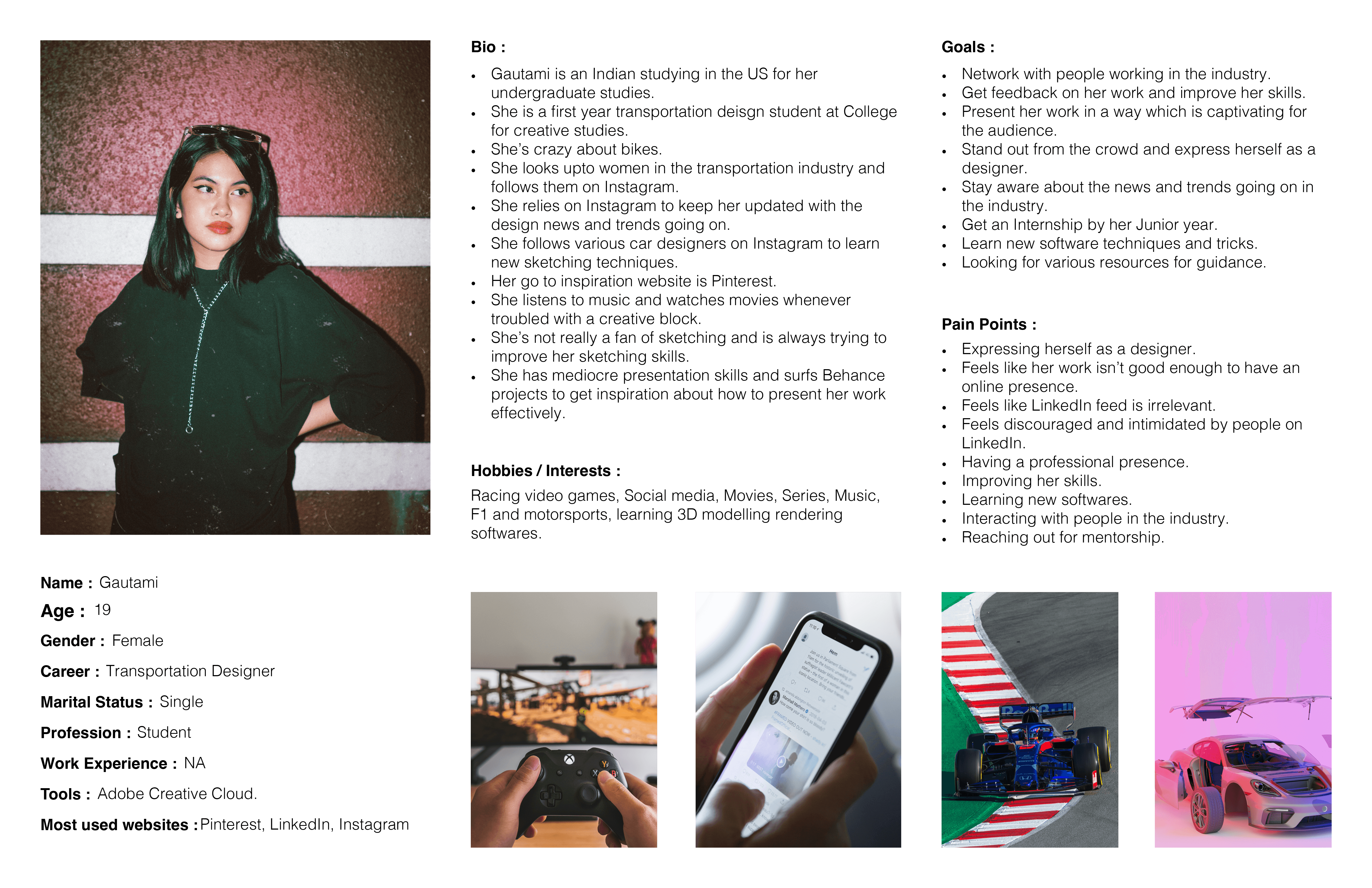
Initial research was done in the form of semi-structured discussions conducted with a total of 16 creatives belonging to the different ages in the range 18-32, creative backgrounds, career stage and country.
01.
User’s understanding of the Behance.
03.
Current habits and tools they use in their creative process
05.
Usage habits on Behance
02.
User’s perception and painpoints about Behance.
04.
Creative choices, creative blocks and what inspires them.
06.
User's opinion on current direct/indirect competitors.
Opportunity Areas


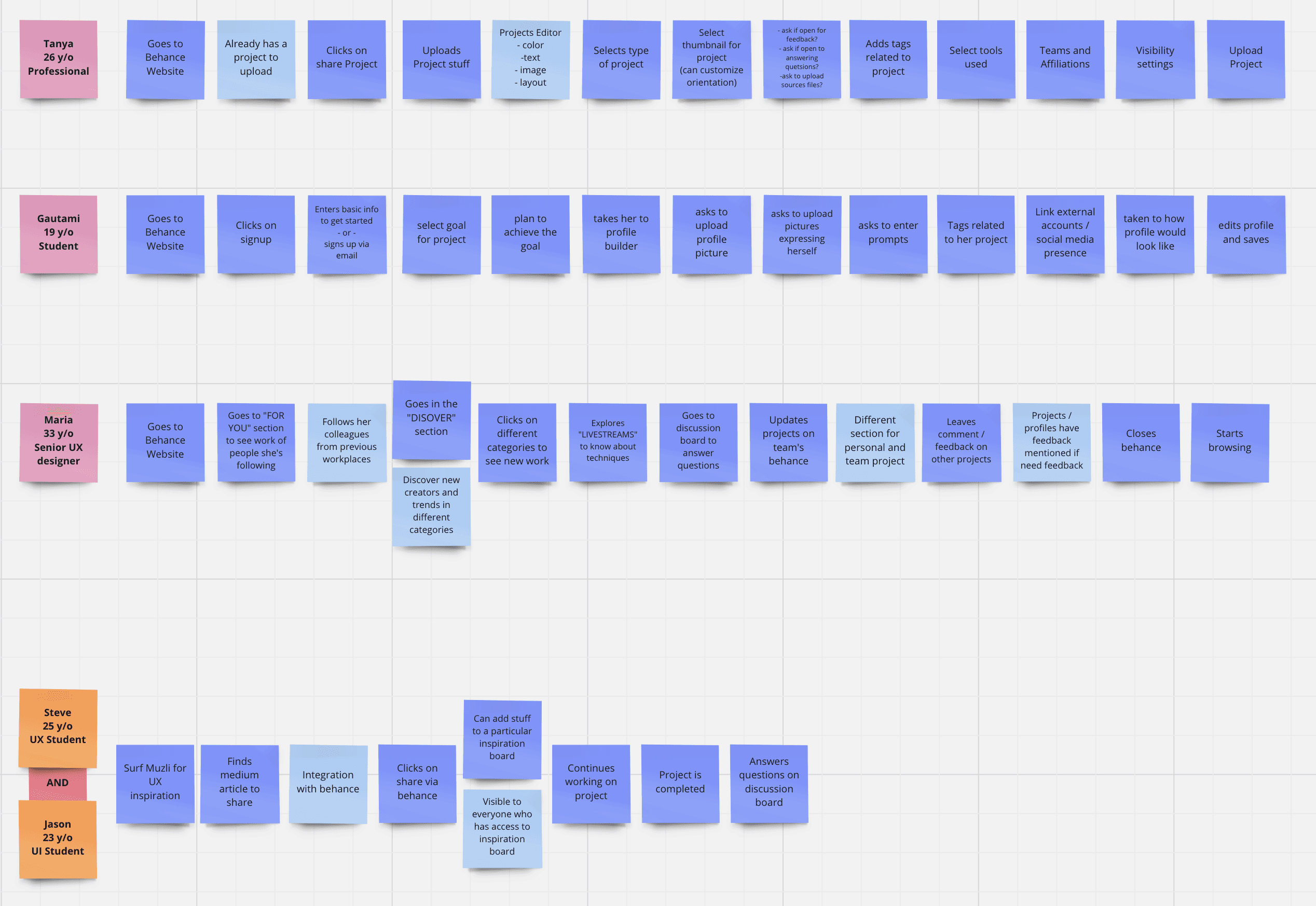
Personas
Key opportunities & process maps
An opportunity exists to help people distinguish themselves from other creatives.
An opportunity exists to enhance the way projects are presented on Behance.
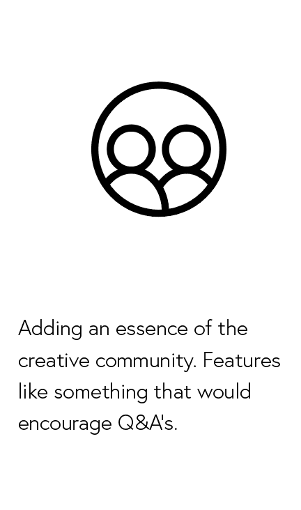
An opportunity exists to provide better engagement between audience and creators.

Wireframes
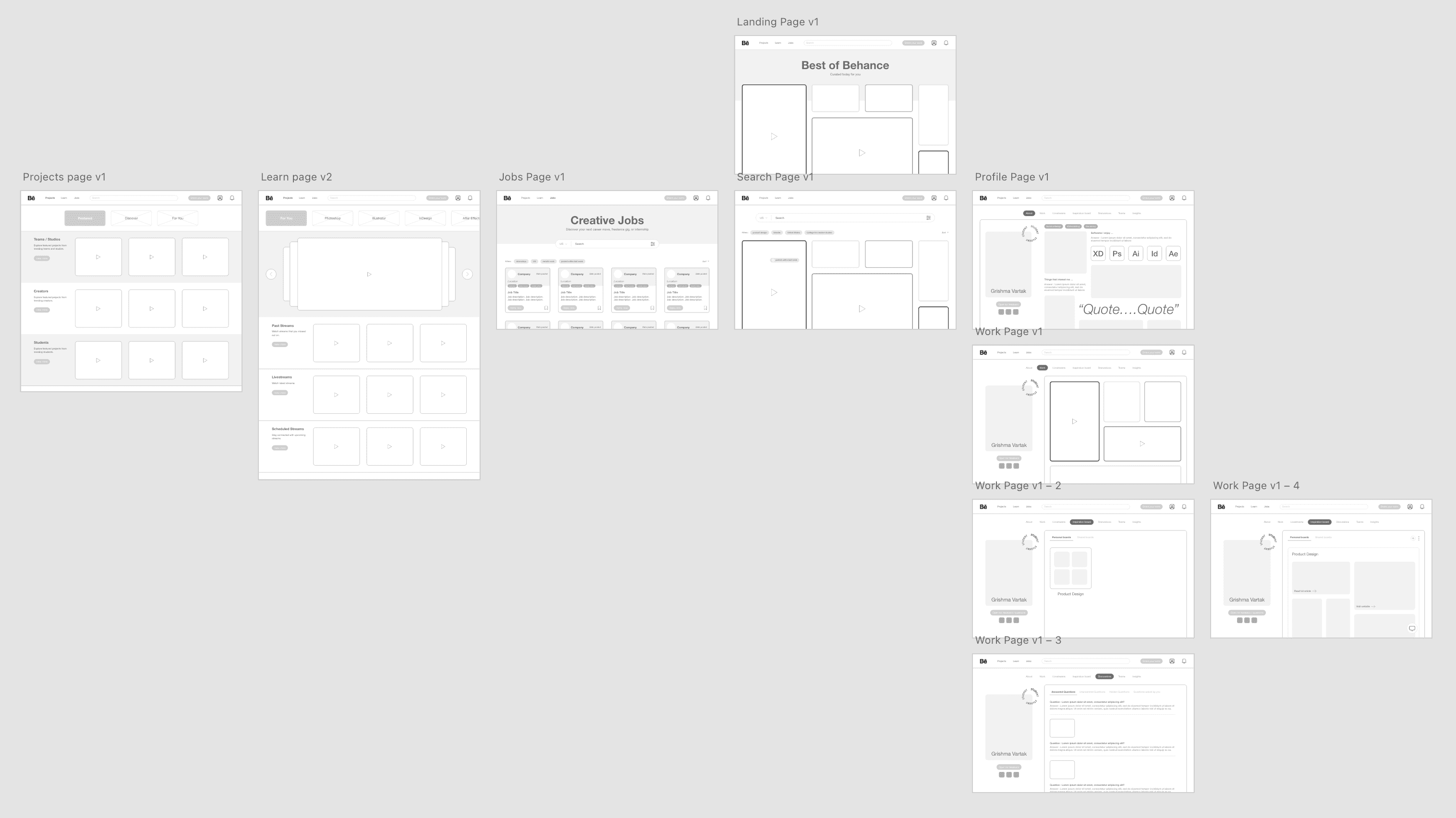
UI Design
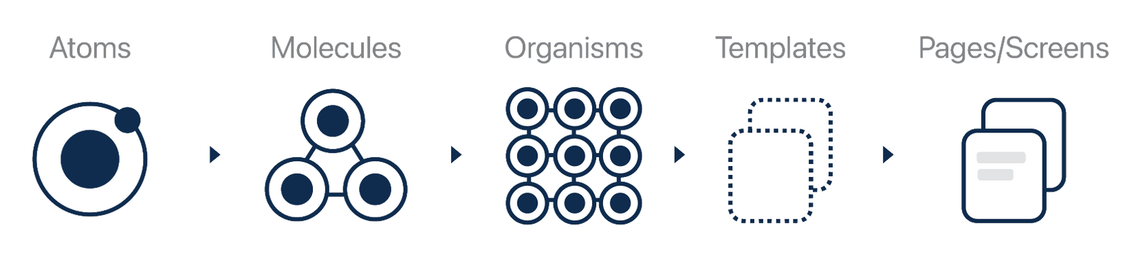
My UI design process was based on Brad Frost’s atomic design process


FInal Concept
Making an account on Behance is now a more goal oriented and personalised task. Due to a wide range of users on Behance, they can select their goal of creating a Behance account after which the website builder will guide them accordingly to create a profile.
The website wizard helps the user add a new project and provide guidance every step.
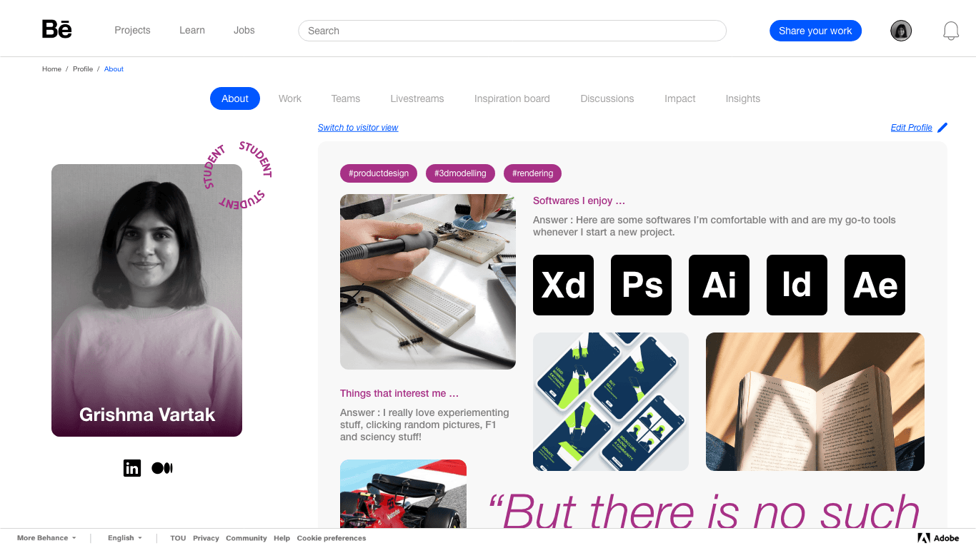
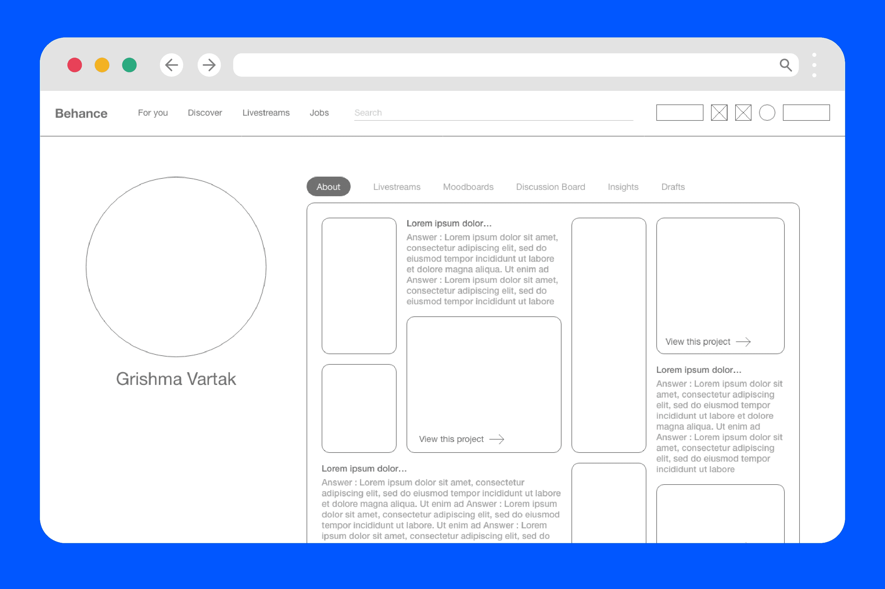
The user’s profile page gives them a chance to express themselves as a designer and standout from others via prompts. It is completely customisable.

Users can also be a part of teams which are bascially the school they go to, studio/company they work for and have their projects featured in the teams tab.
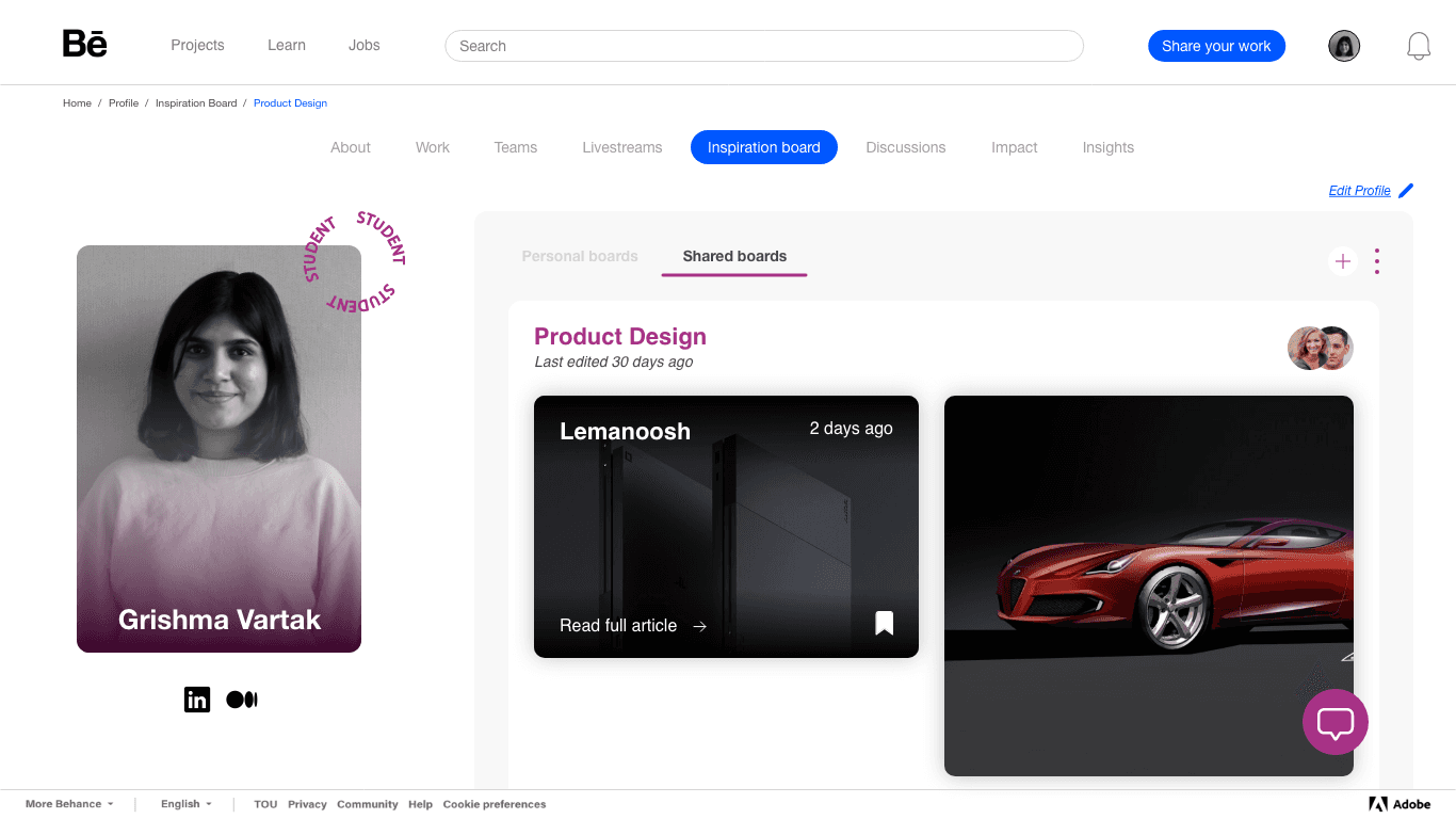
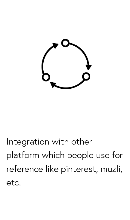
Users now have the ability to create shared inspiration boards and have content integrated from other websites such as pinterest and lemanoosh.
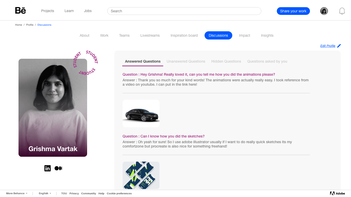
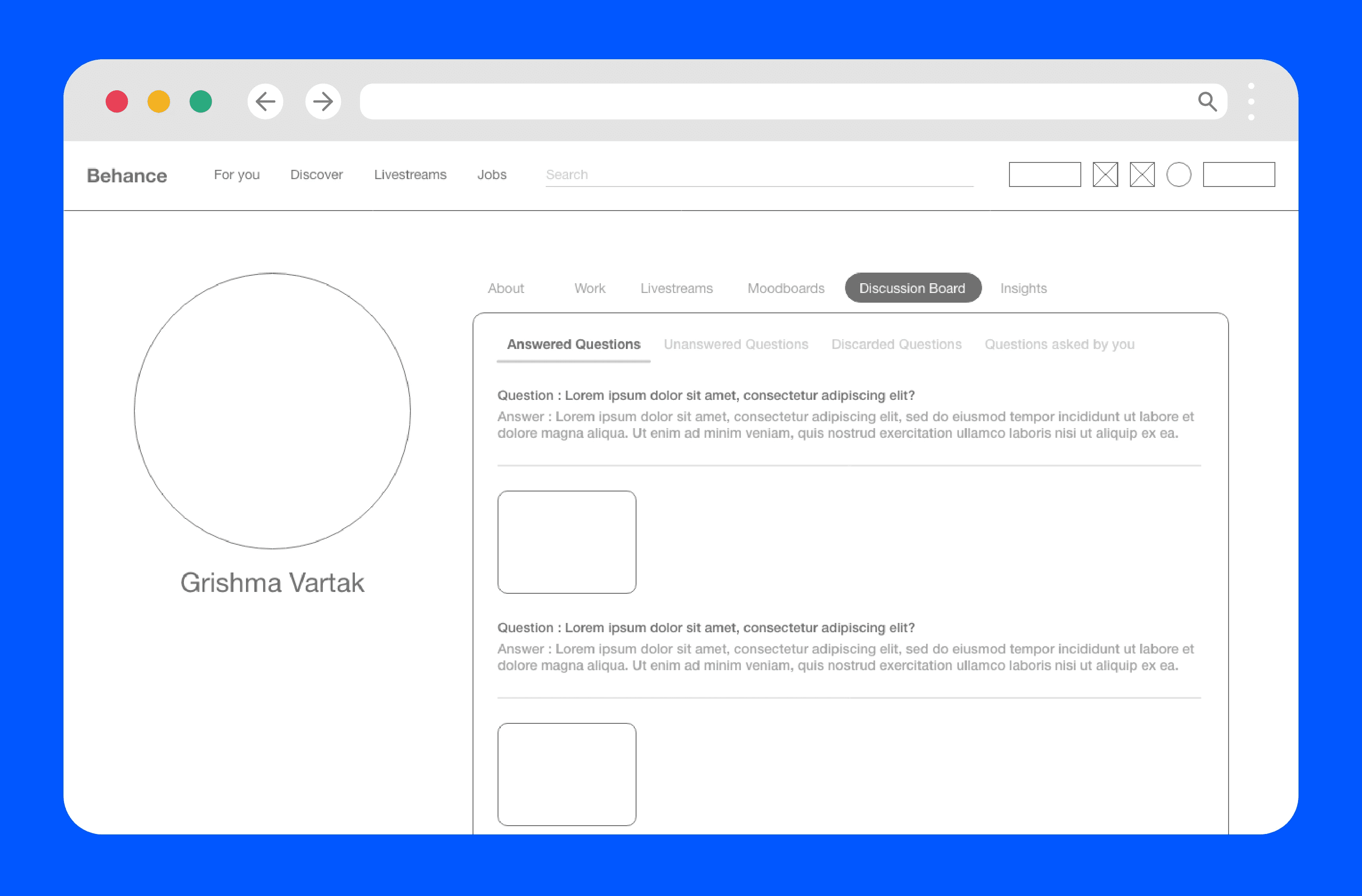
The profile will also have a discussion board where people can leave comments, feedback and questions on a project.
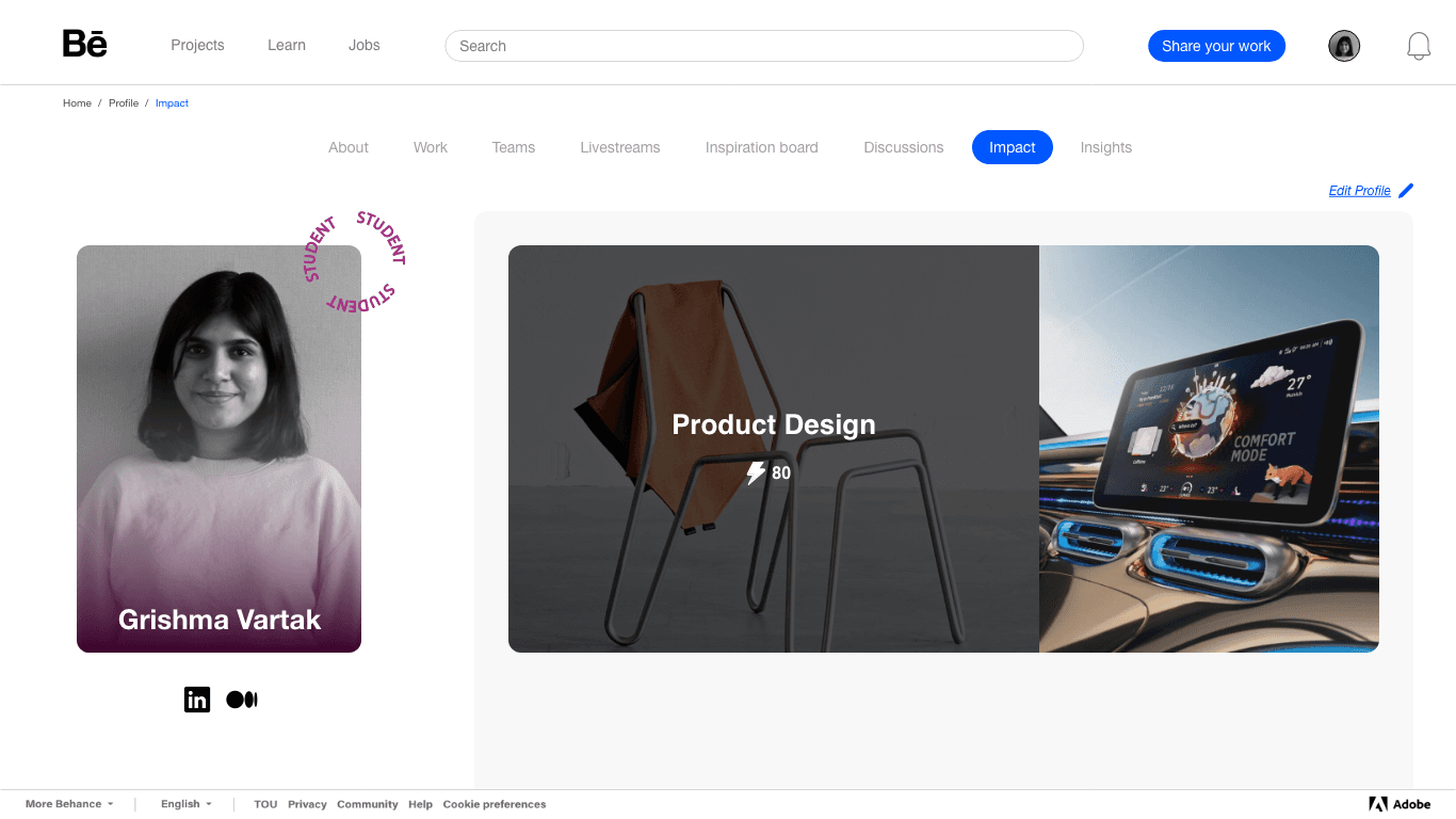
Views and appreciations have been rephrased and combined in a positive language called “Impacts”. Every visitor can view a creators impact score. Impact score increases when someone views the user’s projects and add them to a moodboard.
Projects also get a more defined search strategy and classification according to the different creators, design teams and adobe softwares.
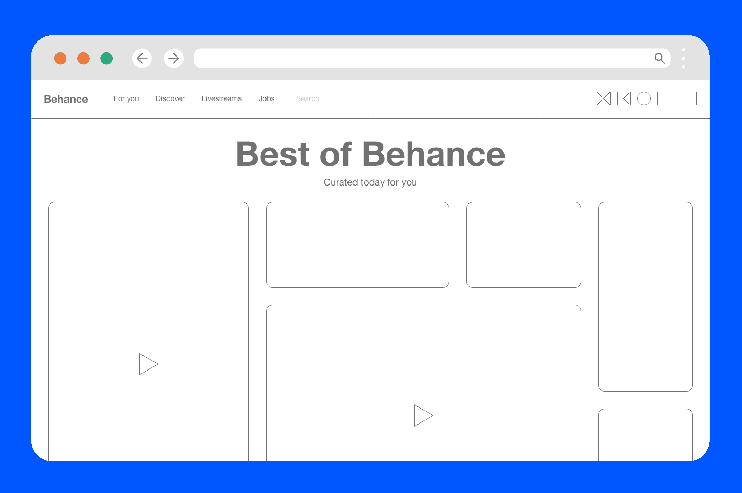
One size doesn’t fit all most times! Which is why the newly designed Behance would preview projects in different thumbnail sizes.

Reflection
What struck me most about this project was how quickly the research reframed the problem. Behance isn't failing creatives because it lacks features, it's because a platform built for everyone ends up feeling like it's built for no one in particular. Sixteen conversations across very different creative backgrounds made that tension tangible and kept the design decisions grounded.
The "Impacts" reframe was probably the detail I'm most glad I pushed on. Metrics like views and appreciations carry an implicit hierarchy that can feel discouraging for early-career creatives, the exact people who need the platform most. Rethinking that language felt small but meaningful.
If I revisited this, I'd want to stress-test the goal-oriented onboarding more rigorously across different user types. The wizard works well in theory, but the diversity of creative fields means the guidance could easily become too generic to be useful which is the very problem the redesign was trying to solve.
Available for full-time roles.
Maybe it's with you.
Get in touch